Impact of the weather on hiking activities is huge. Although the number of hiking applications on the market is big, they fail to incorporate weather criteria as critical for improving their product usability.
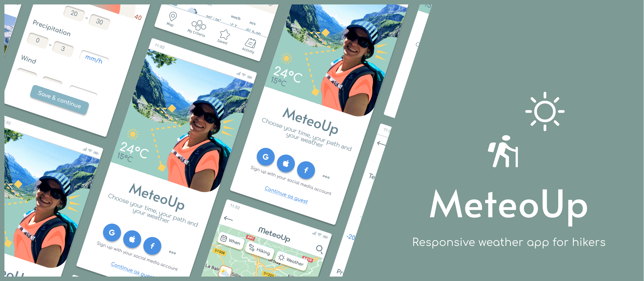
Project Brief
Provide beautifully displayed and easy to understand wind, temperature and weather reports, forecasts and statistics for sport aficionados.
The app is part of the Careerfoundry UX design project 2021 – 2022. The initial idea for a weather app came from CF and the idea to design it specifically for hikers came from me and my friends who hike regularly and in need of a better weather app.
My Role
Lead UX designer, UX Researcher, UX/UI
Responsible for the entire design process, from Discovery to Prototyping, Testing, and producing deliverables.
Project Duration
6 months
Tools Used
Figma
Google Forms
Usability Hub
Optimal Sort
Marvel
Paper + Pencil
Overflow
Mission
Impact of the weather on hiking activities is huge. Although the number of hiking applications on the market is big, they fail to incorporate weather criteria as critical for improving their product usability.
Hikers have specific needs and we are on our mission to design a product that will prioritise these needs, satisfy our business objectives and make it technically feasible.
Design Process
Competitive Analysis
User Research
Wireframes & Prototypes
Usability test
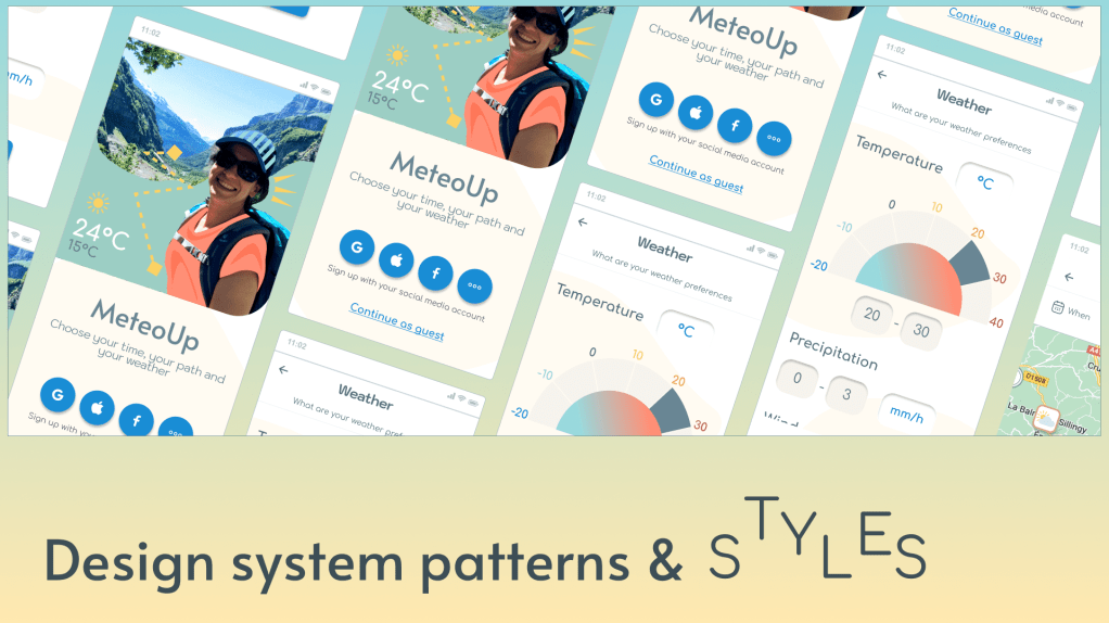
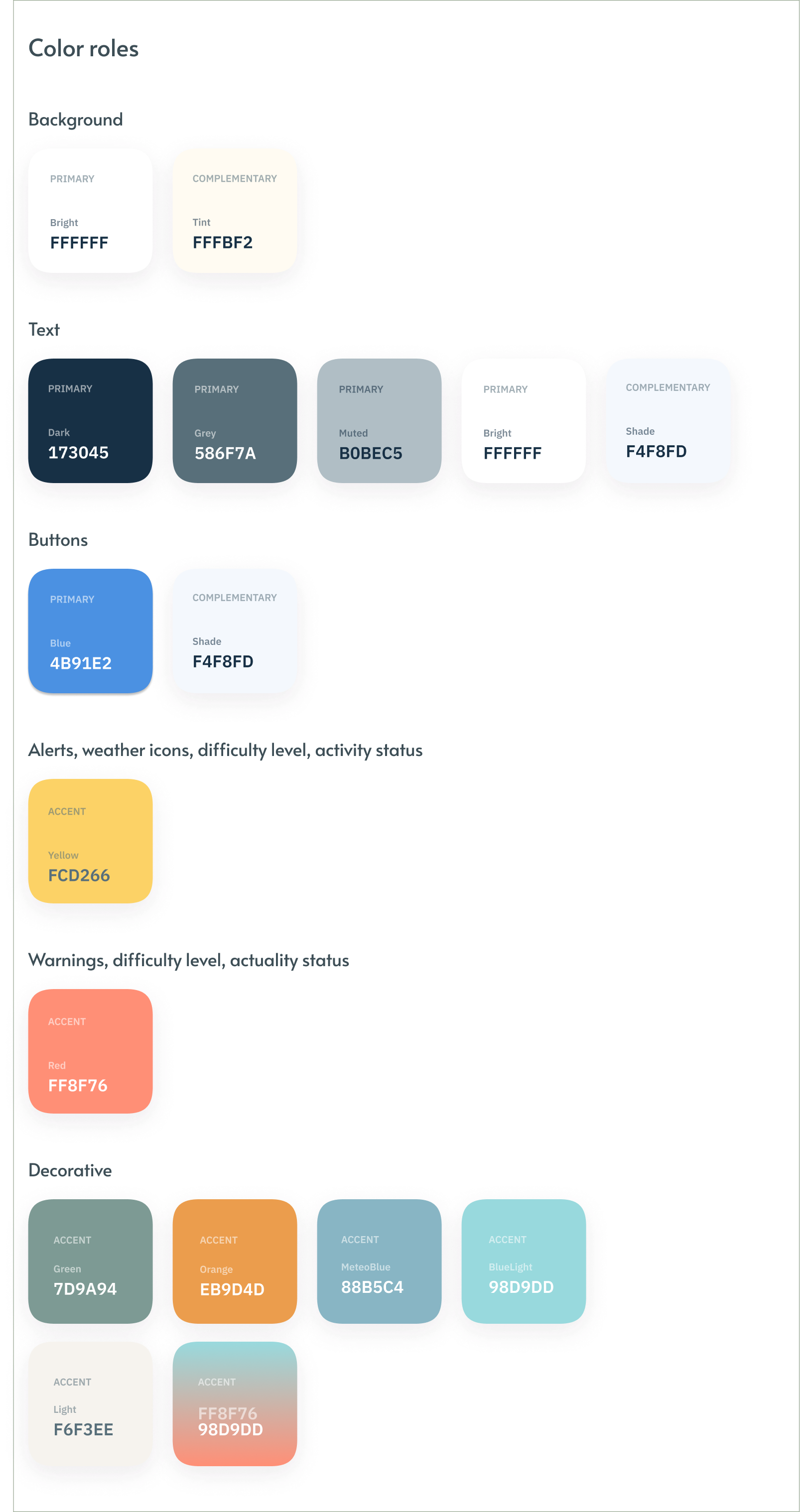
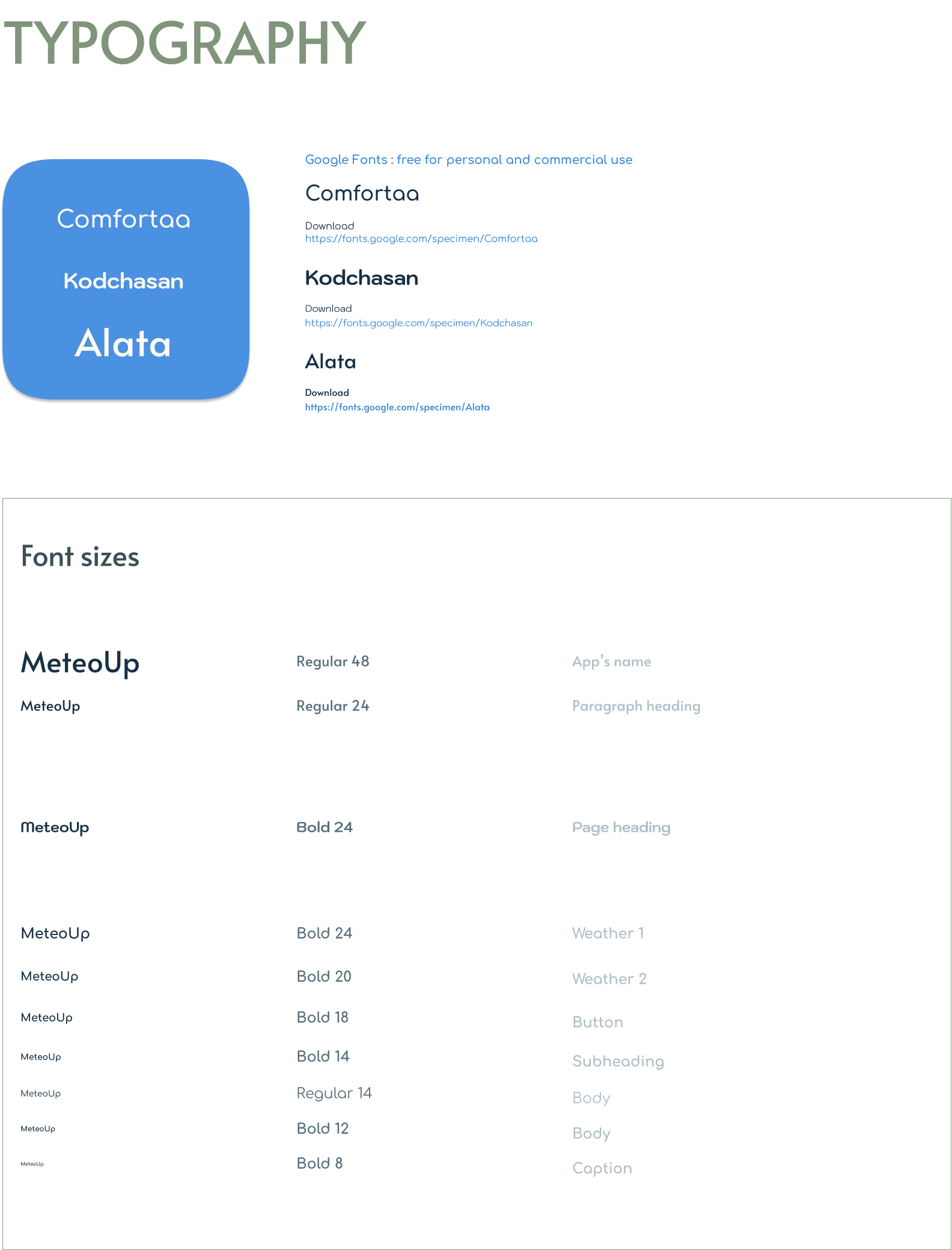
Design language system
Accessibility
Polishing the design
Updated prototype
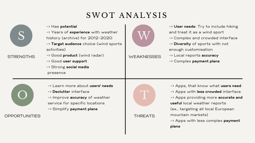
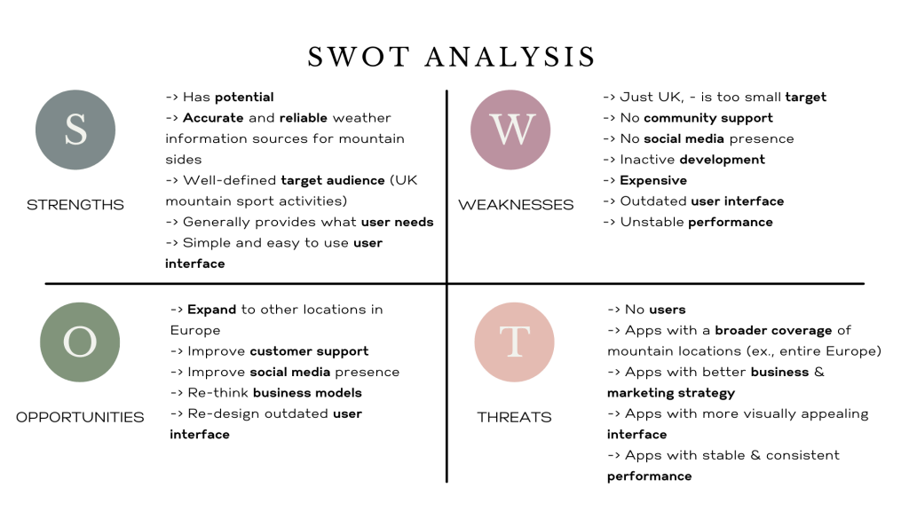
Competitive analysis
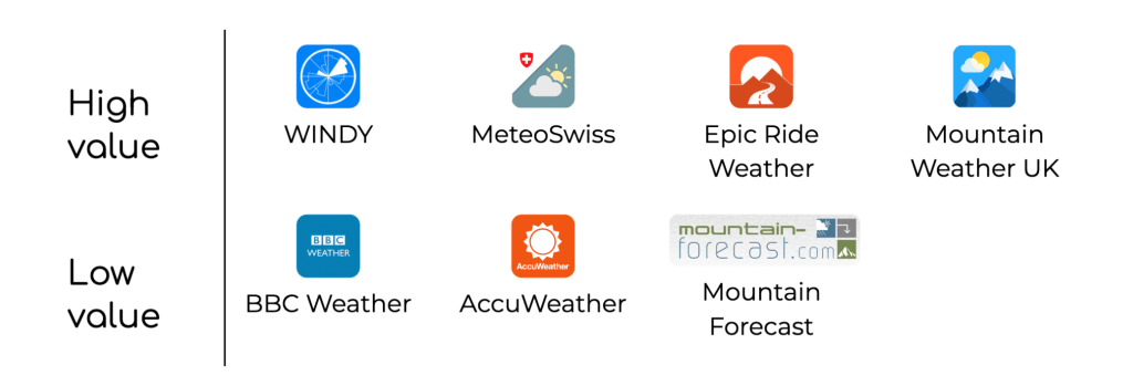
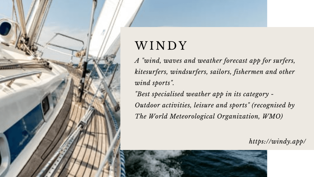
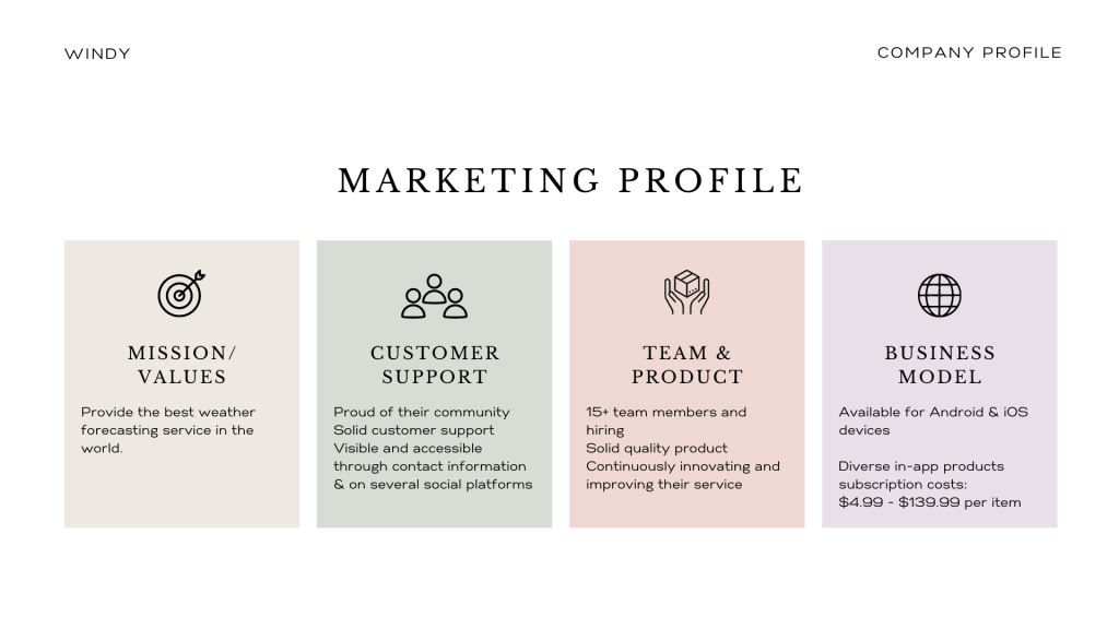
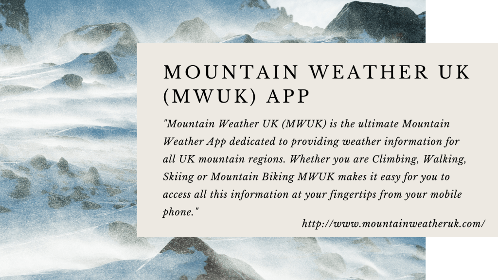
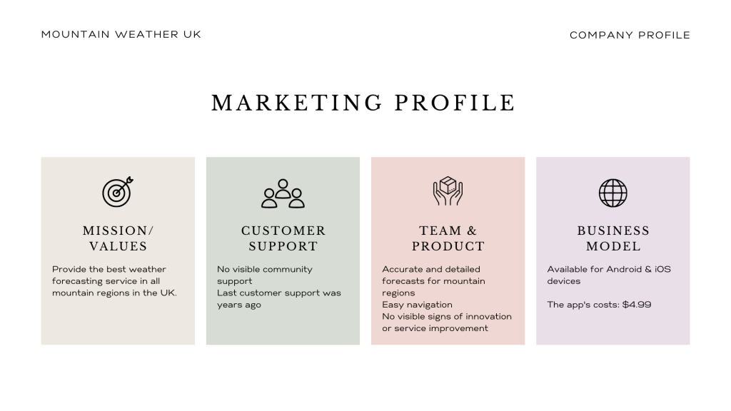
I looked at the competitor landscape and selected WINDY and Mountain Weather UK (MWUK). Both apps are weather apps for outdoor activities.
WINDY provides all kinds of weather services worldwide. Its business model is quite ambitious. The app’s interface is busy, which makes it difficult to navigate. Its payment plans system is complex, but it has a strong social media presence.
MWUK provides mountain weather services locally in the UK. It has no social media presence, its business model is not ambitious enough and its interface is not modern. But, it has a potential, because its forecasts are accurate and the app has all essential features for assessing mountain weather conditions. MWUK’s website is still operational and its service has a consistent performance.
Competitive Analyses

Surveys & Interviews
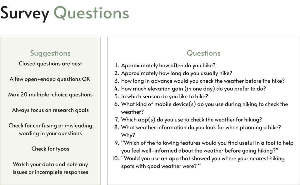
To better understand user’s behaviour around hiking activities I designed a survey to collect data on the context in which hikers would use a weather app.
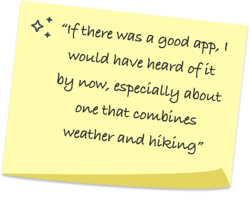
The surveys helped me to determine tasks for users to complete during user interviews. During the interviews I asked participants about pain points with the weather apps they are currently using and about features they would like to have.
Survey Highlights
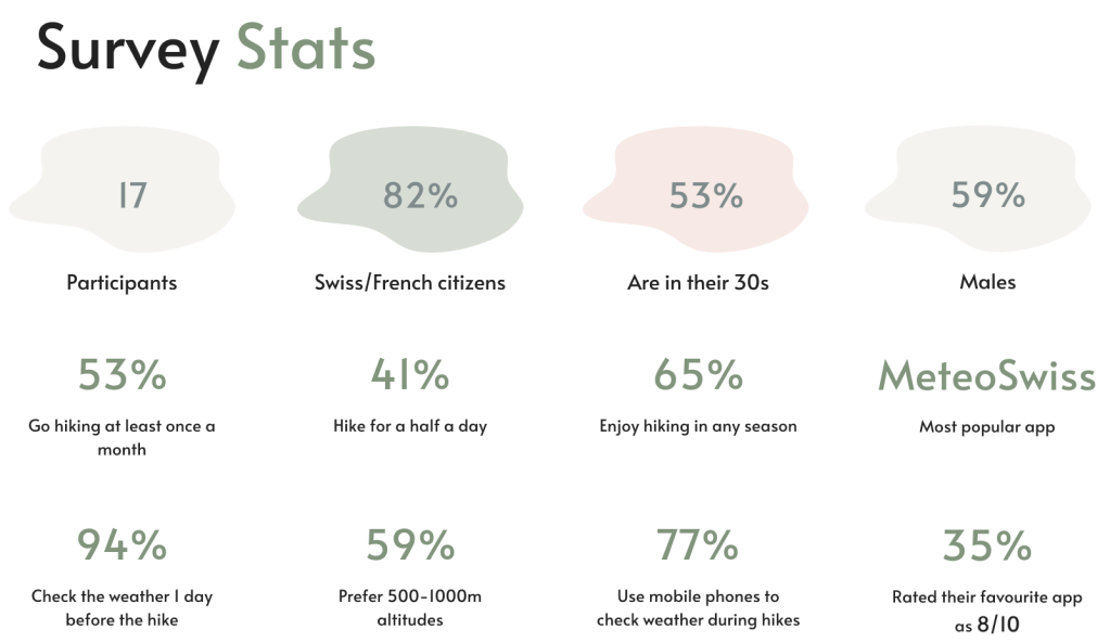
- Most participants were from France and Switzerland who hike regularly and prefer local apps to check the weather before going hiking.
- Most are quite satisfied with their favourite app, which turned out to be MeteoSwiss, a pure weather app, without any features to support the needs of hikers.
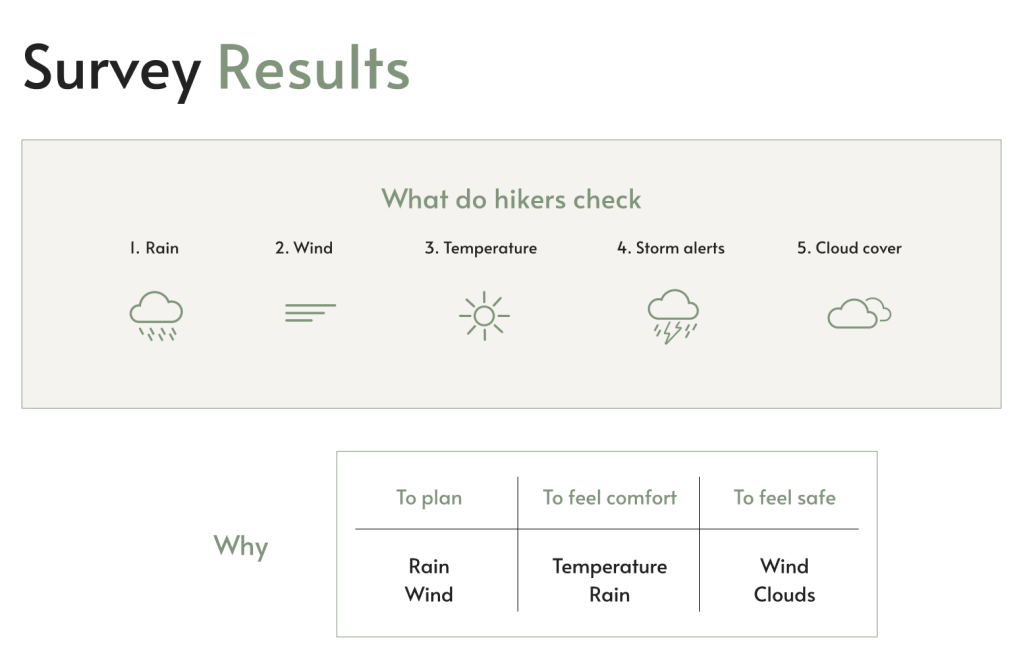
- To plan a hike, most hikers check rain and wind conditions in the mountains.
- To feel comfort, they would look at temperature and rain.
- To feel safe, most would check wind and cloud cover information.
- Serious hikers would like to have weather alerts.
- When I asked “Would you use an app that showed you where your nearest hiking spots with good weather were?” 100% answered “YES”.
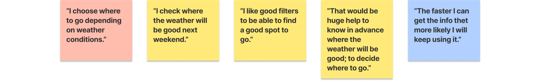
Interview Highlights
- When deciding on WHERE to hike exactly, weather is the most important factor.
- Hikers (experienced or not) want to be aware of places with “good” weather in the area where they plan to hike.
- Hikers expressed their need for the weather alerts.
- The user interface matters. Even experienced hikers often use only basic features of weather apps.
Hikers need an easy way finding places with “good” weather
Additional takeaways
- Learn about the user’s perception of “good” weather.
- Perform additional competitive analysis on the MeteoSwiss app.

Defining the problem
Problem
When planning their fun activities in the mountains hikers need help in finding the best area to hike based on their specific criteria.
To find the right spot, hikers need to be well-informed about the weather. And when the weather conditions change, hikers would like to be notified, to adjust their plans if necessary.
Solution
An app that allows hikers easy access to useful information displayed in a clear and easy to understand manner, such as:
- Best areas to hike based on their weather and other hiking criteria
- Weather forecast along the trail
- Warnings and recommendations related to the hiking activity
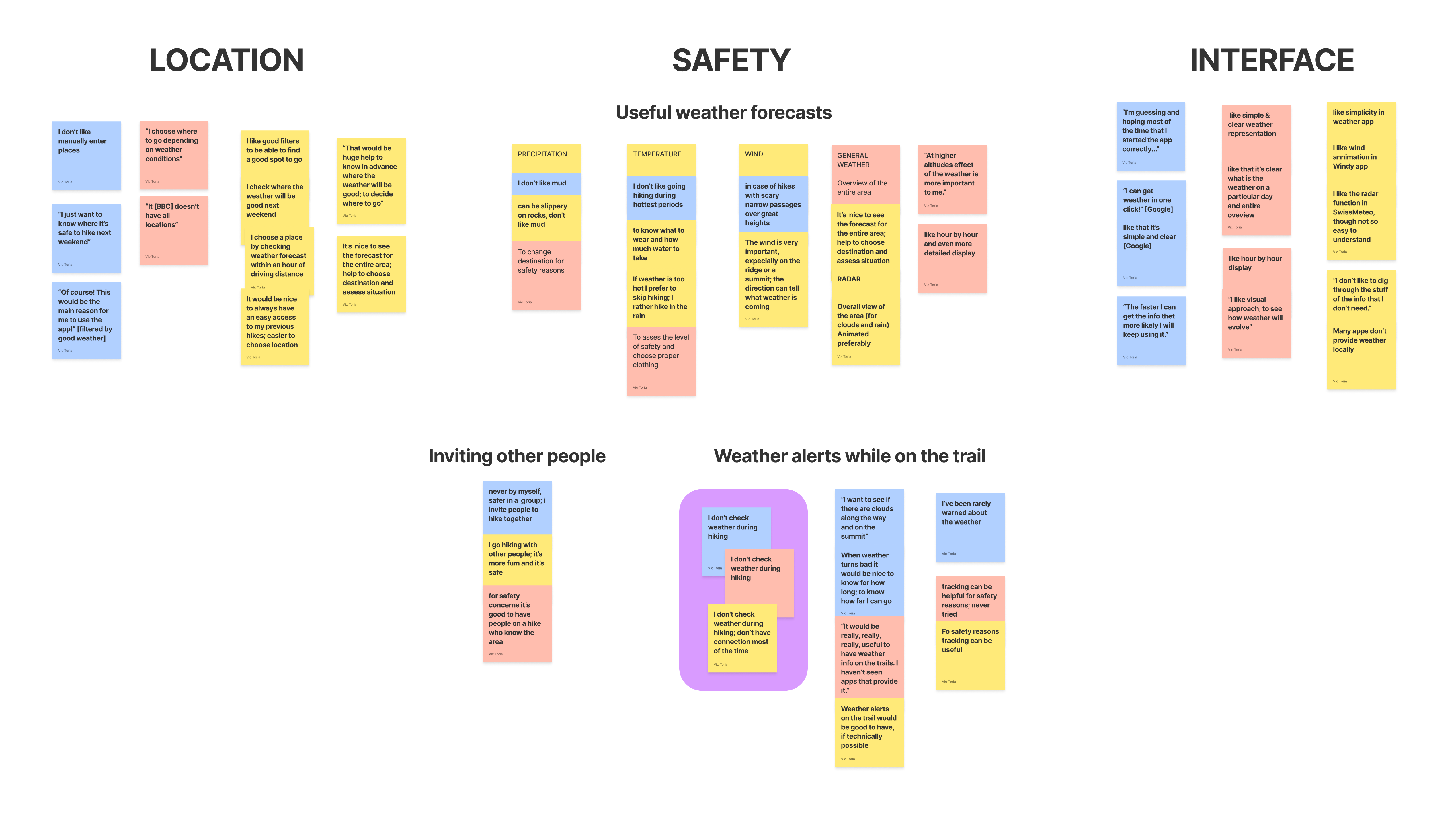
Affinity Map
Affinity map helped to organise the surveys and interviews findings and gather user insights. The map showed that what hikers really want is to know WHERE the weather will be “good”, HOW safe is there to hike, and HOW easily they can get information they want.
User stories
Finding the “best” places to hike (key story)
As a user who likes to hike when the weather is “good”, I want to be able to select a location based on my personal criteria.
Weather at different altitudes
As a user who goes on serious hikes and whose decisions highly depend on the weather, I want to be able to check cloud cover and wind information at different altitudes, so that I know what equipment to bring.
Weather display
As a user who plans hiking activities depending on the weather, I want to access weather information for the entire area where I plan to hike and for a specific location, so that I can plan accordingly.
Weather alerts
As a user who is cautious about safety, I want to be notified about important changes in the weather, so that I can stay safe.
Weather along the trail
As a user who goes on long hikes, I want to be aware of the weather conditions along a trail, so that I can make well-informed decisions about what is ahead and when to turn back.
Live cams
As a user who likes certainty, I want to have access to camera views at the selected location, so to be certain that it’s as sunny as the forecast says before I hit the road.
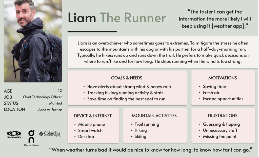
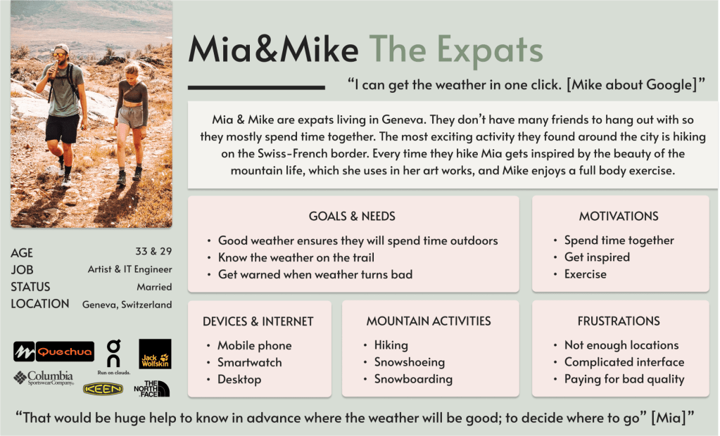
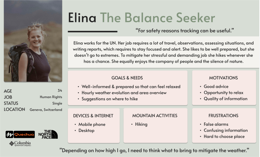
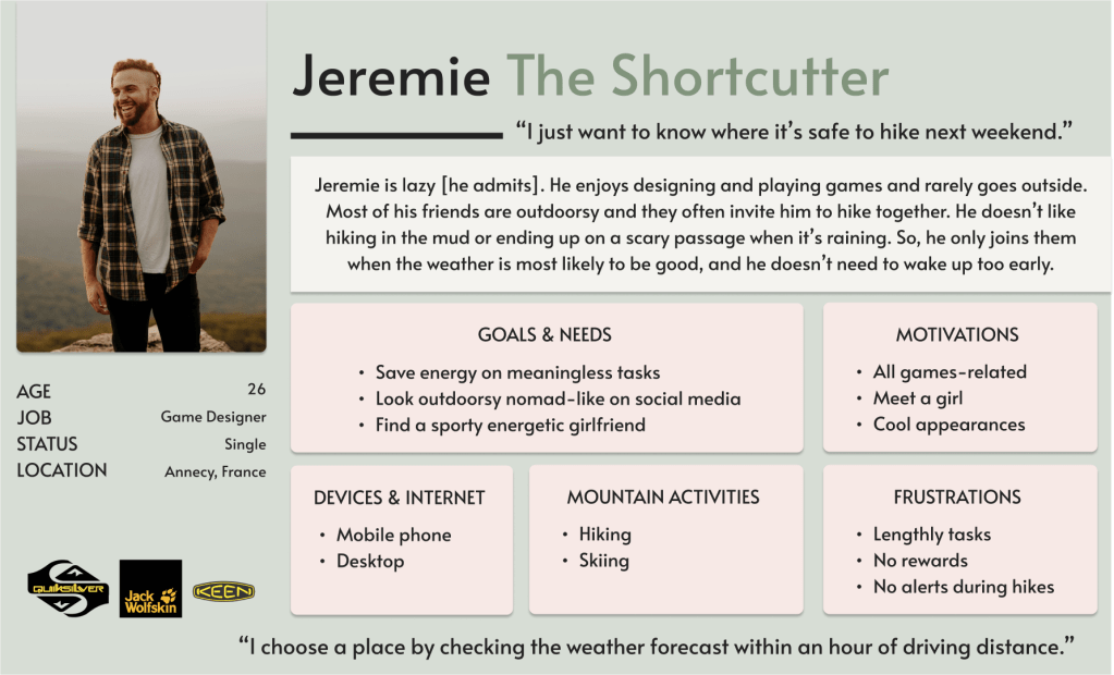
User personas
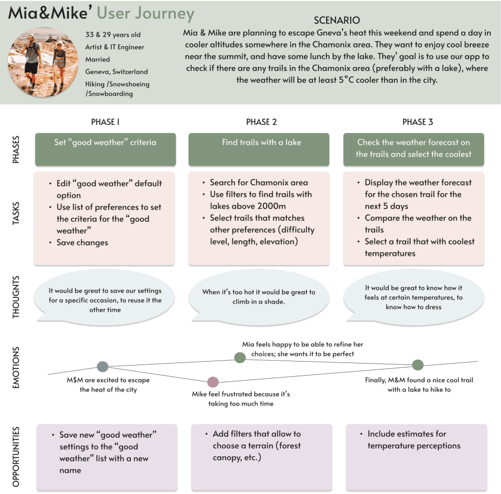
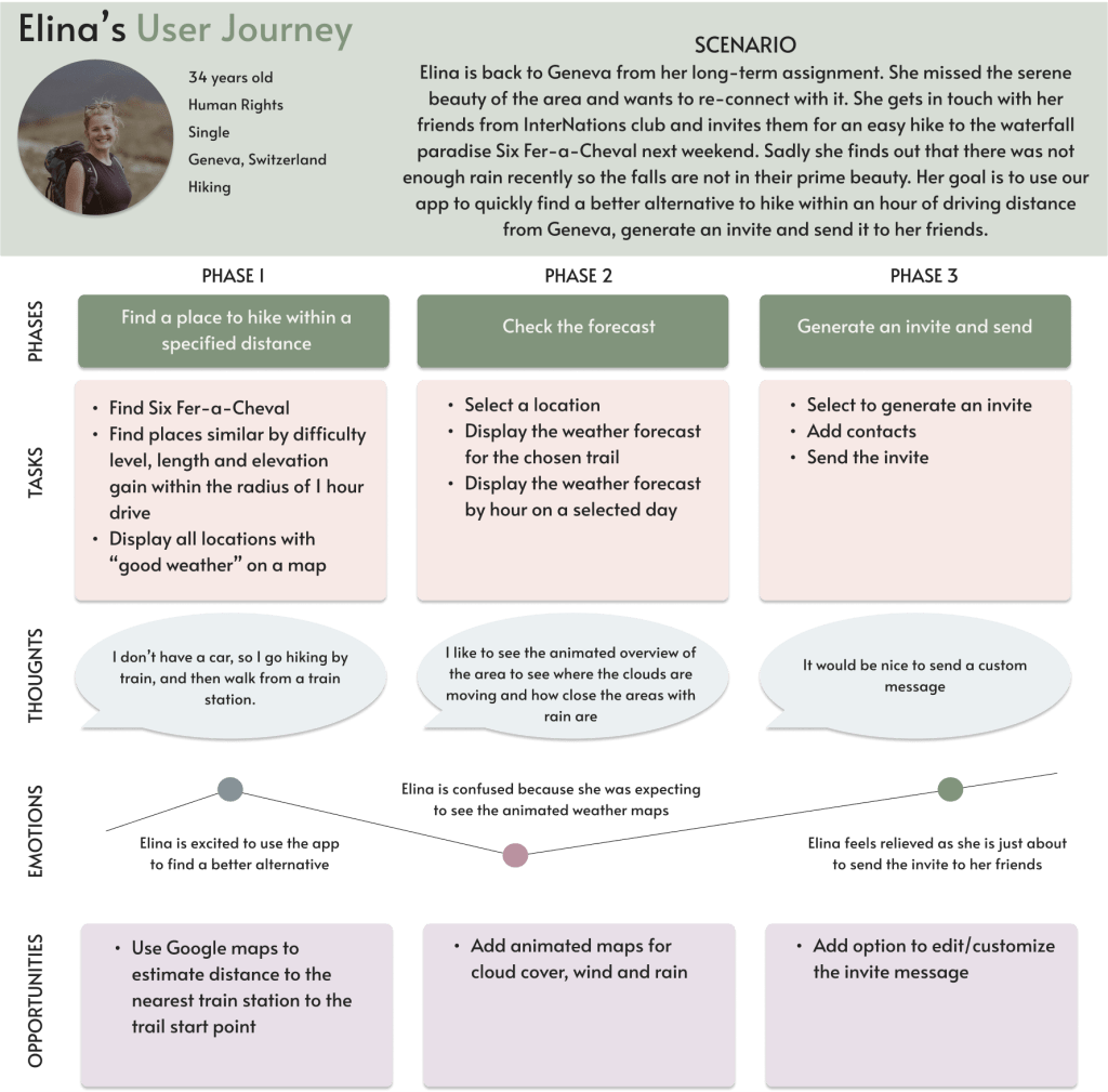
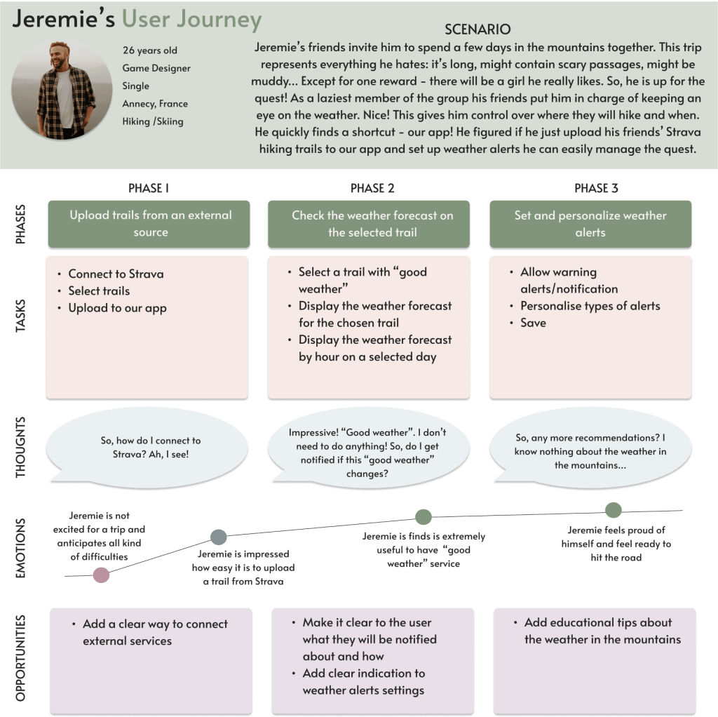
Based on the results of my research I created 4 user personas: Liam, Mia&Mike, Elina, and Jeremie.
Mental Models & User Journeys
To identify opportunities for MeteoUp I needed to understand users’ mental models. Based on the qualitative research of users’ needs and POVs (see Surveys & Interviews above) I created journey maps for each persona.
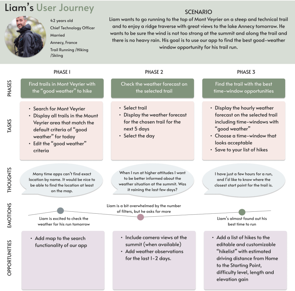
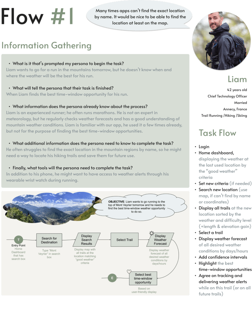
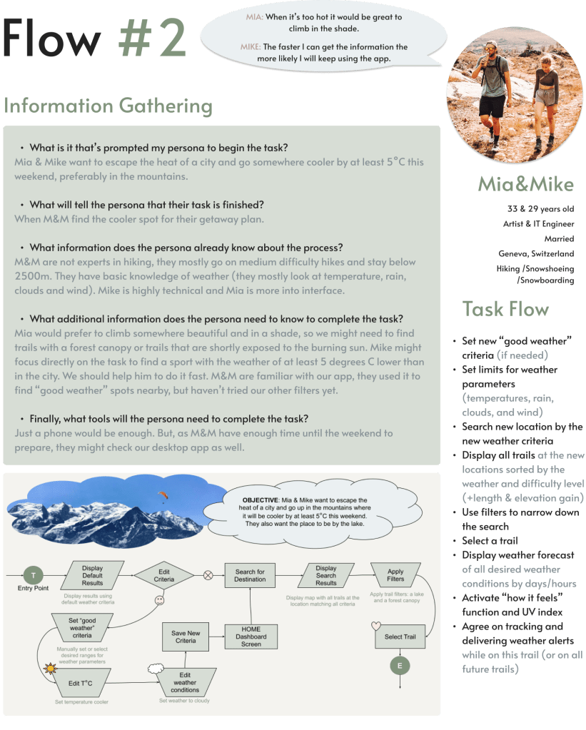
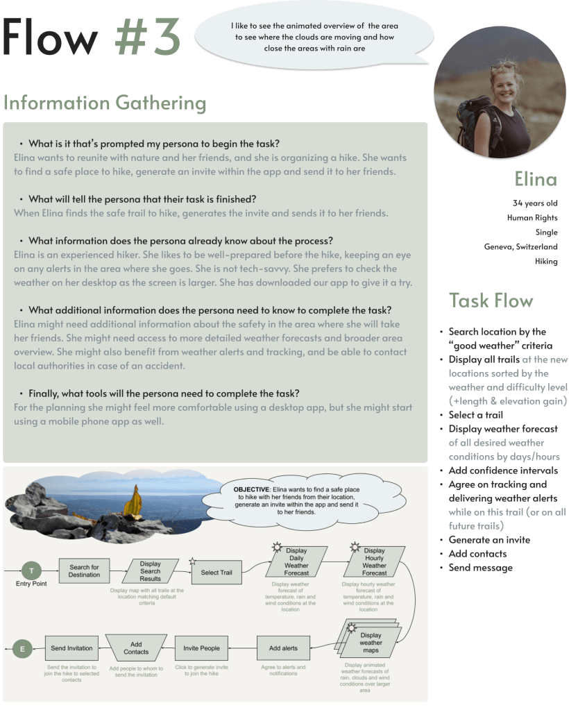
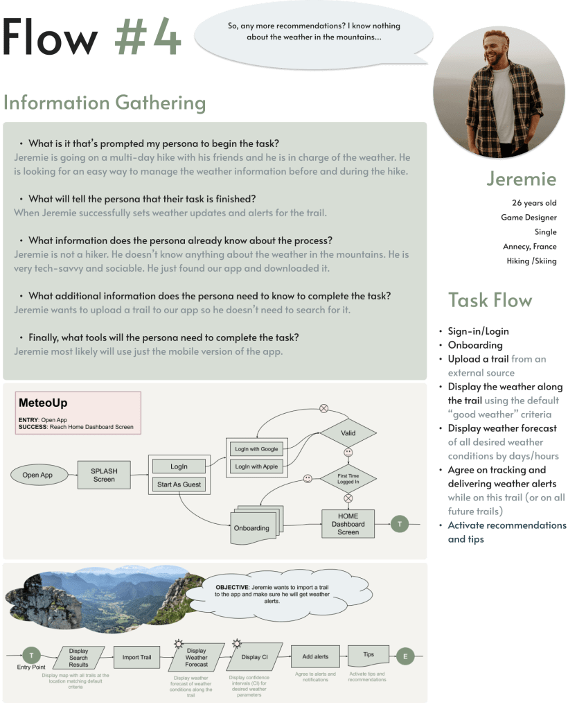
Task Analysis & User Flows
Based on personas’ user journeys I was able to create user flows and task analysis for each persona.
User Research


Refining Sitemap
To address the issues with the initial sitemap, and to find a better organisation of the pages and their options, I conducted an open card sorting study using Optimal Workshop.
I asked 14 participants to group the cards and to name the categories the way it would make sense to them.
Using similarity matrix I identified strong card pairing and potential groupings for the app, and improved the sitemap.
This was important to do as early as possible to find out how the target audience thinks.
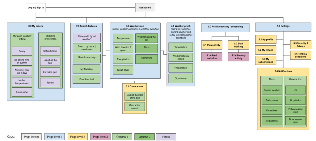
Takeaways
- I was afraid that the new feature “My “good weather” criteria” which is based on peoples’ perceptions of weather conditions and their personal experience would create confusion. To my pleasant surprise, the feature was received very well and placed into its own group by 100% of participants. It means that this feature should receive special attention and be designed with care.
- Some cards were grouped together by 100% of participants, and some were not, which suggests that some cards (ex., with 50% overlap) can be placed into different categories or combined into one. For example, “Tracking & Saving activity” and “Planning & Inviting” can be placed either into 2 different categories (“Tracking activity” and “Planning activity”), or into the same one (“Activity”).
At this point I started thinking that maybe the app is too ambitious… I had to be careful here and select only important user stories for the user flows.
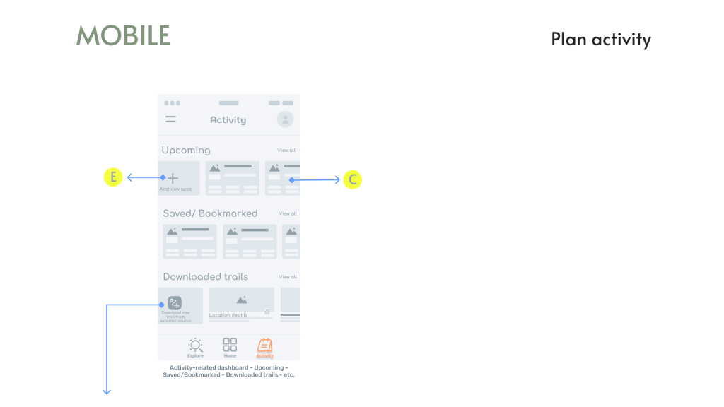
Wireframes & Prototypes
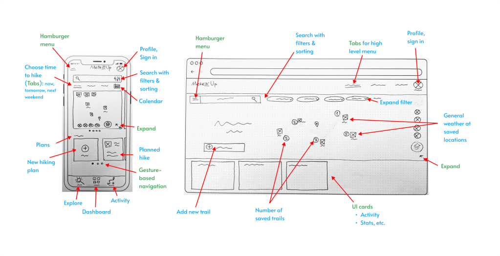
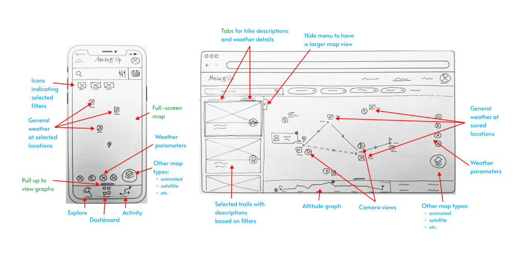
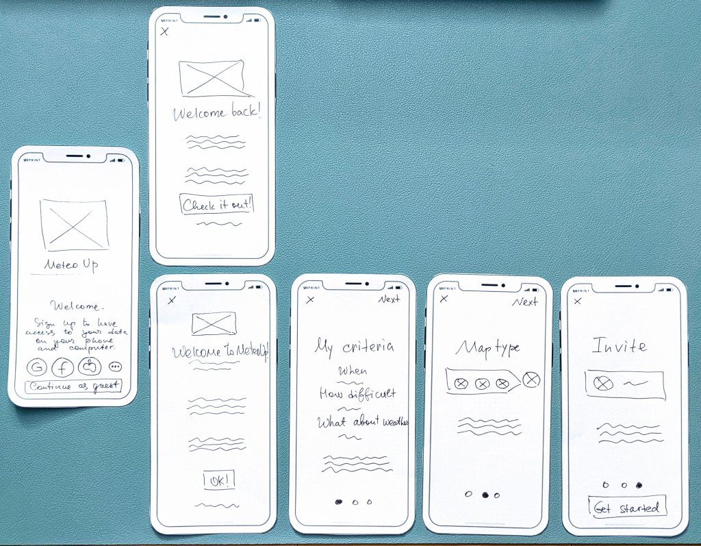
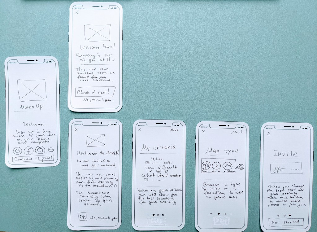
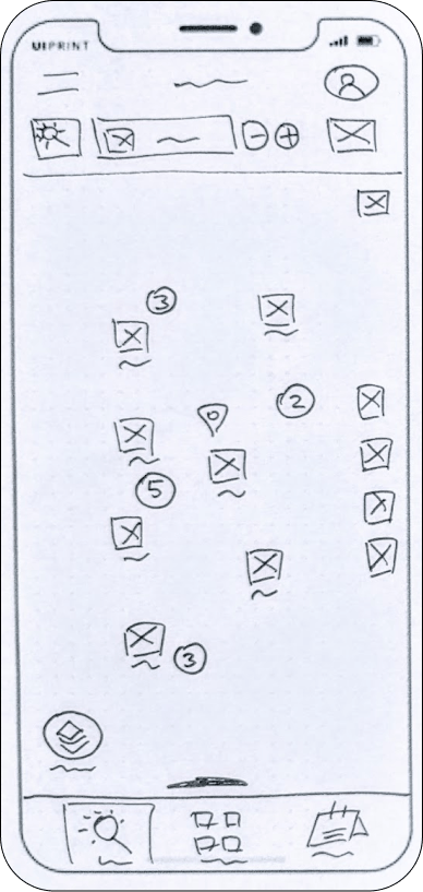
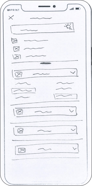
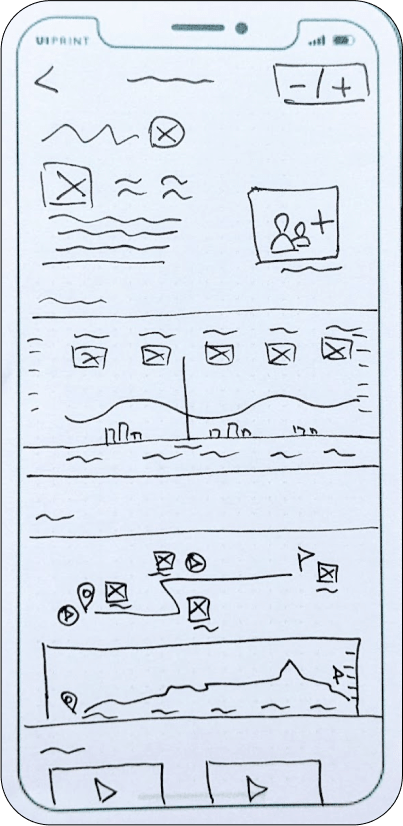
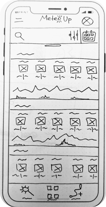
Low-fi prototypes
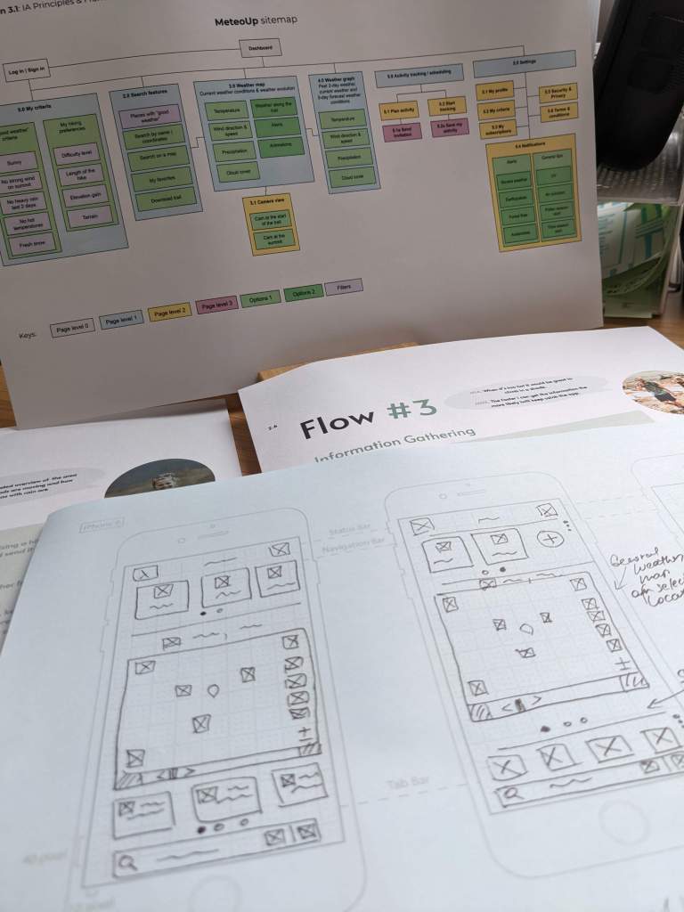
When I started working on the low-fidelity prototypes I soon realised that my sitemap is not helping. I had too many options, which I could fit on a desktop screen, but wasn’t able to fit on a mobile screen.
I sketched close to a hundred low-fidelity prototypes keeping my persona’s needs in mind. Below are a few sketches of MeteoUp for the desktop and the mobile apps.
The paper prototyping helped me to brainstorm my design ideas faster than using a tool. It’s an important step in the design process, especially when working in a fast-paced environment with others. Using paper prototypes I could quickly accept or reject the ideas and also easily pitch my design ideas to others.
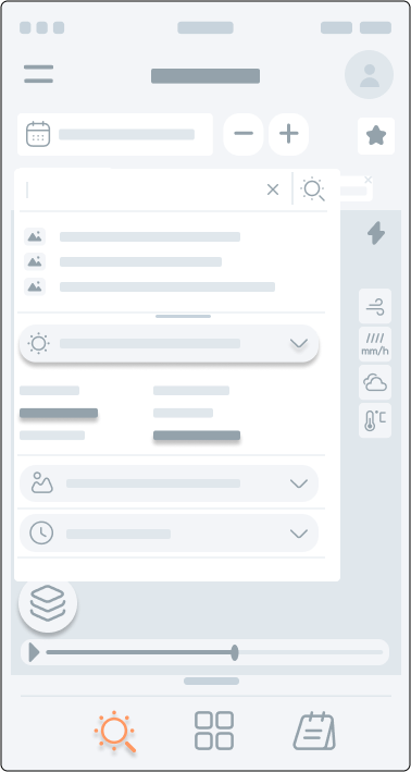
Mid-fi prototypes
Moving to mid-fidelity prototypes was exciting and challenging; there were too many features to design in a short period of time. It was hard to imagine an actual user experience without meaningful interactions within the app. The logic behind screens kept breaking apart. I navigated through the screens manually to see if I can follow my personas’ task flows. Something was always incomplete or created a complexity for the persona to reach their goal. I continued to iterate and improve until the result was good.
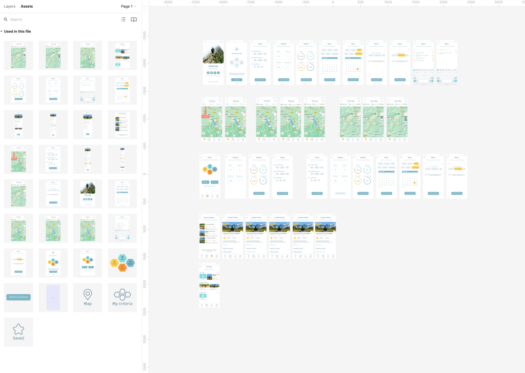
Mid-fidelity prototypes in Figma…
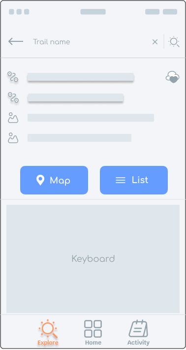
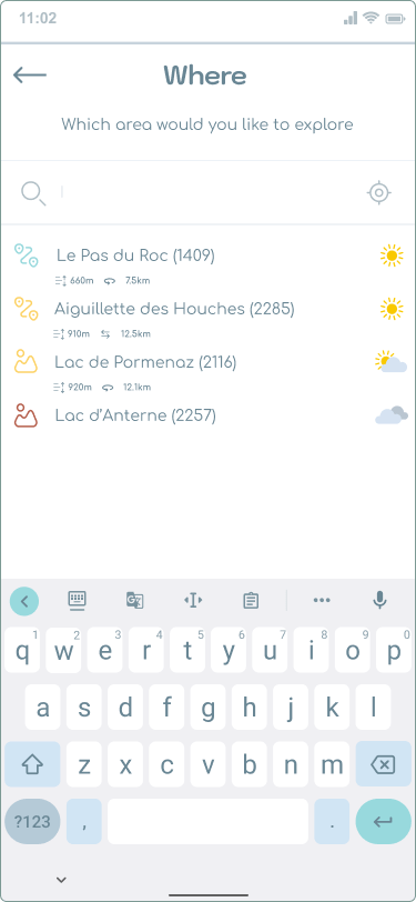
High-fi prototypes
I looked at several apps on the market (Google, AirBnB, MeteoSwiss, etc…) to draw inspiration. When I had a good experience with the flow, I considered reusing it in my app as well. I started with familiar features:
- how to search and bookmark a location,
- what type of map to use, and
- what type of menu to use.
Then, I looked at specific features for my app, such as how to display the weather parameters on a map, on a graph, and in a table. After I gained an inspiration, I had a better idea of what is on the market, what people might like or expect, and what might be good to add in MeteoUp.
The high-fidelity prototypes helped me verify the task flow design works reasonably well. That is, whether the user personas can achieve the goals for each flow easily without confusion and hesitation. At this point I was looking forward to usability testing to gain insights about further improvements.
High-fidelity prototypes. in Figma…
High-fidelity prototypes in Figma…
Usability testing
About
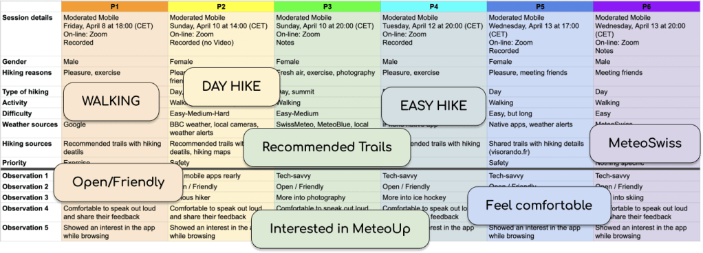
This usability test was a moderated study that was held in-person in Switzerland and remotely in other locations in the world, mostly in Europe. Participants (> 18 years of age) were asked to try an interactive version of the app’s prototype using their own devices, complete several short tasks and share their thoughts about their experiences. The study was conducted using screen-sharing software (Zoom and Google Hangouts).
Reasons for conducting the test
- How users think when navigating. How can I reduce users’ cognitive load = to improve navigation within the app?
- What the onboarding process should be about:
- Setting up hiking criteria? This would have the added benefit of introducing an important functionality of the app.
- Introducing the app? This would help users understand the app, and get them interested in learning how to use it.
- Both? Can we achieve both of the above benefits without making the onboarding too long?
- Which features to prioritise. Is “Less is more”?
- Declutter screens. How would a deeper hierarchy to the navigation of the app affect the test users? How easily will they be lost?
Goals
The main goal is to better understand user’s mental models and improve the flow of the app.
Objectives
- Ask participants to complete several short tasks and share their thoughts about their experiences.
- Observe how easily participants can complete the tasks.
- Determine how many errors do participants make, how severe are these errors and how easily can participants recover from those errors.
Method :: Moderated in-person and remote
To conduct this usability test, I followed the best practices for working with human subjects:
- Created a user test plan. [4.3]
- Recruited participants. [link]
- Introduced them to the app that is being designed, its goals and objectives.
- Asked for their consent.
The full test plan can be found here [4.3] and the test script here [4.4].
Data Analysis
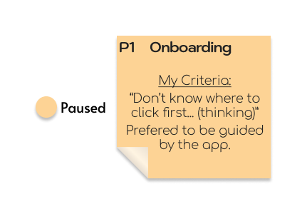
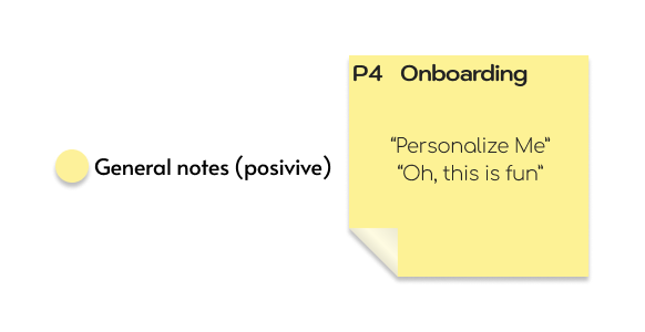
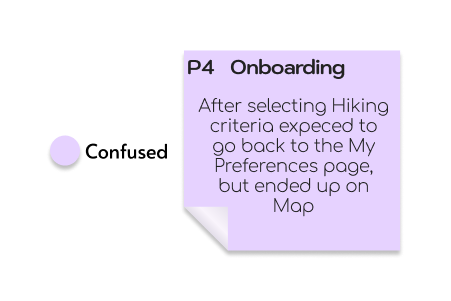
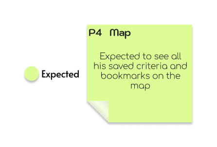
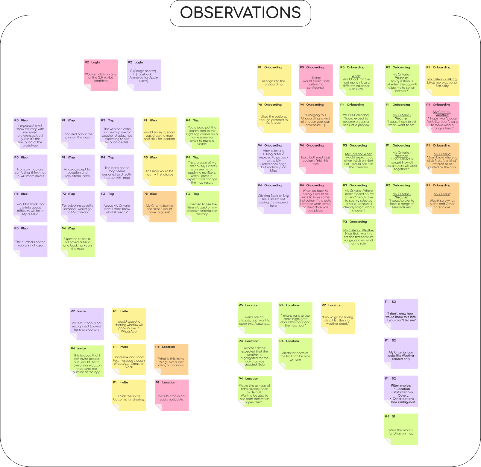
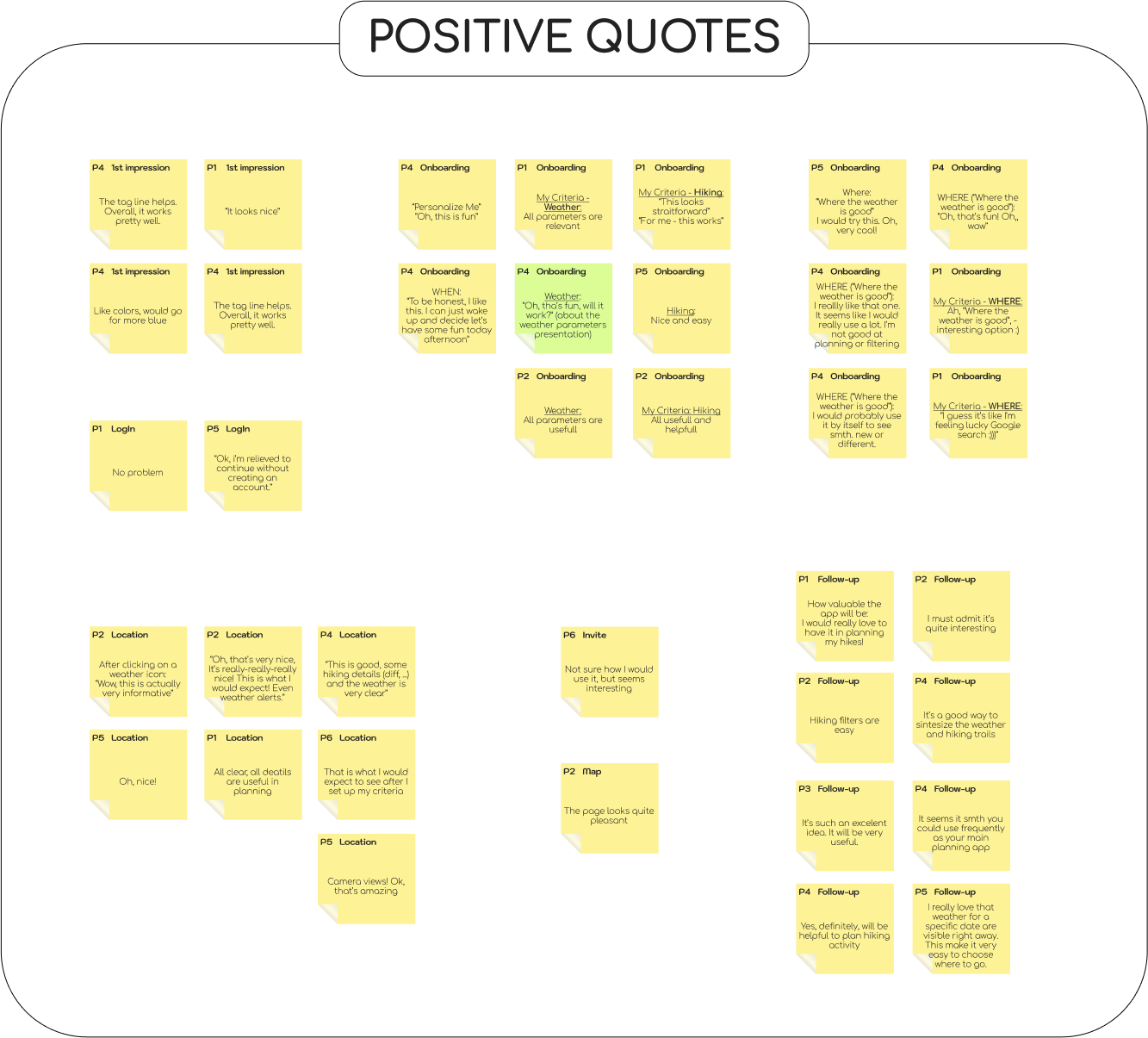
1. Affinity diagram
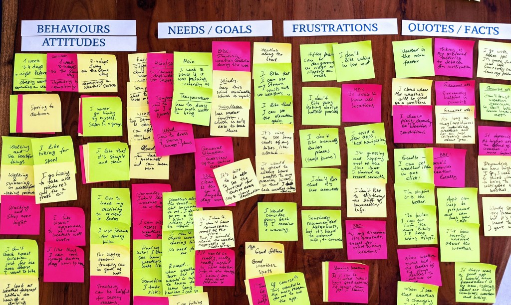
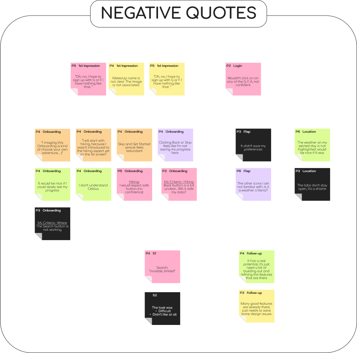
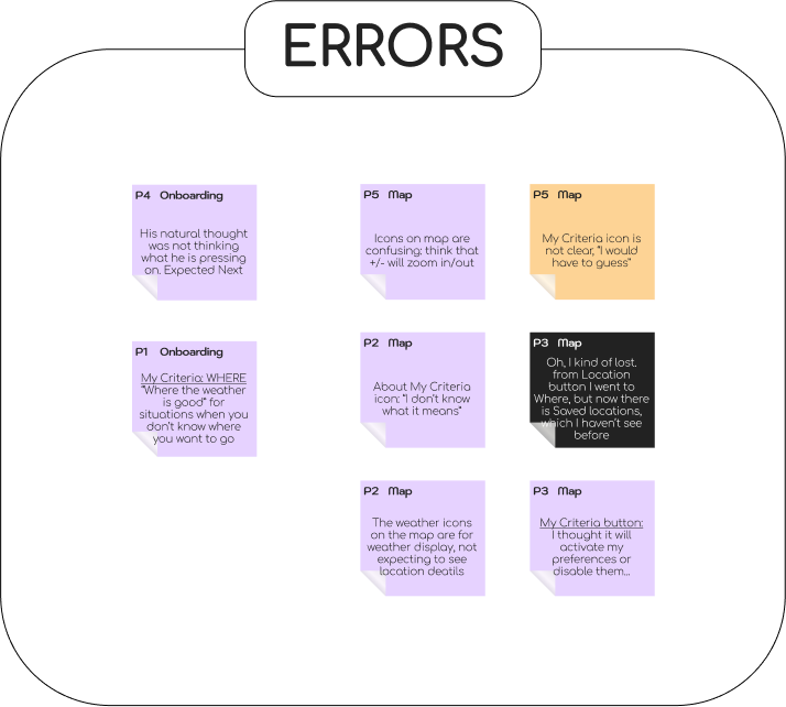
To look for patterns, I created an Affinity map of quotes from the interviews and split them into four sections: OBSERVATIONS, POSITIVE QUOTES, NEGATIVE QUOTES, and ERRORS. Within each section, I used colours to indicate when a participant paused during completing a task, got confused, was concerned, had expectations or hopes, or was unhappy.
2. Rainbow spreadsheet
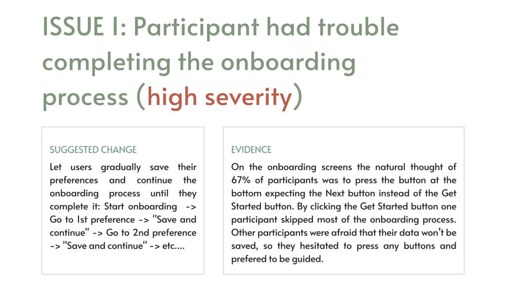
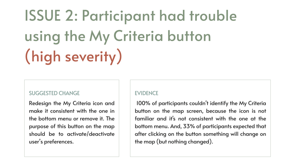
I selected the relevant notes and organised them on a Rainbow spreadsheet, splitting the observations into DOING, THINKING and FEELING, and I chose the most urgent errors that participants made during the tasks. Then, I rated the errors using Jakob Nielsen’s Scale:
| 0 = I don’t agree that this is a usability problem at all |
| 1 = Cosmetic problem only: need not be fixed unless extra time is available on project |
| 2 = Minor usability problem: fixing this should be given low priority |
| 3 = Major usability problem: important to fix and should be given high priority |
| 4 = Usability catastrophe: imperative to fix before product can be released |
Results
Observations
All participants felt comfortable to speak out loud and share their feedback. All showed an interest in the app while browsing, even though we experienced various technical problems during the online sessions.
To sum up
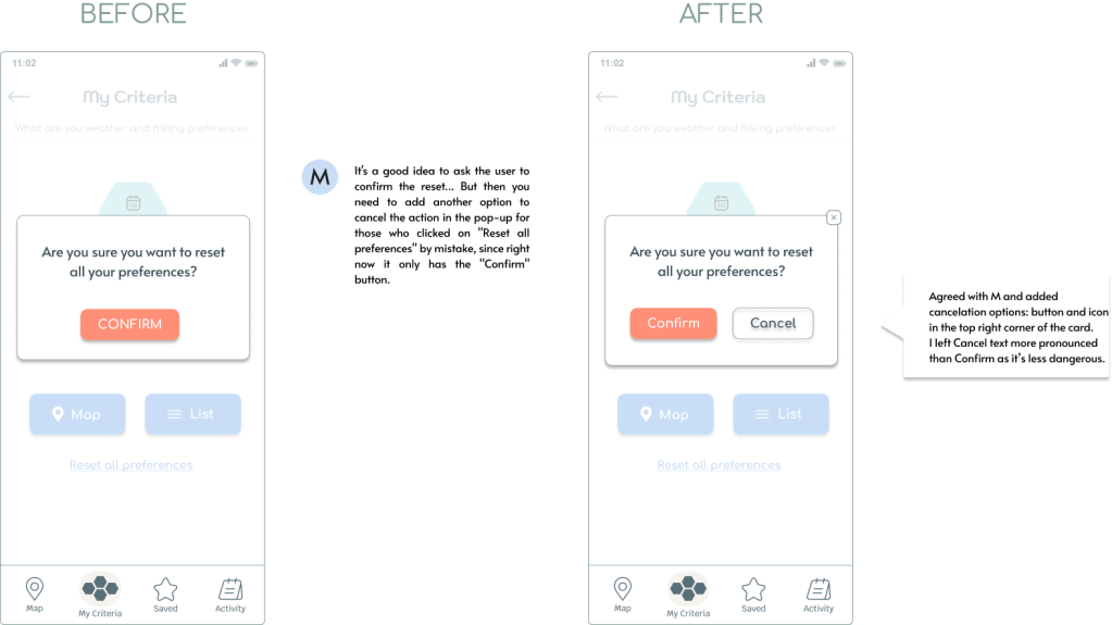
- The concept of the app is attractive, but needs a wow. -> Needs a better UI.
- A little confusion about What/Who is it for. -> Need to make it more clear.
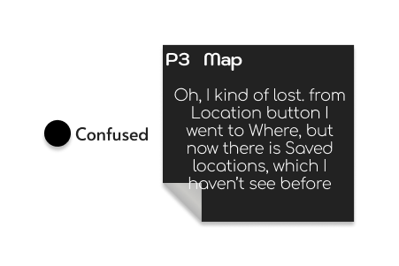
- Major usability issue with the search with filters function. -> Needs redesigning.
- Some usability issues with the map. -> Make it more interactive and “respect” the flow.
- The “Where the weather is good” button seems popular. -> Make it more accessible.
Issues & Possible solutions / changes
The affinity map and the rainbow spreadsheet helped identify issues in the app’s design on which most participants agreed, and it helped prioritise issues.
What did I learn
All participants found MeteoUp valuable and relatively easy to use. Overall, they expressed positive experience with the app. Participants were able:
- find the best spots for their hiking activity,
- verify the weather,
- navigate to location details, and
- invite friends to join them.
On the other hand, they were not able:
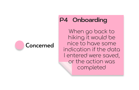
- complete the onboarding process,
- had trouble getting back to their preferences to change them, and
- found the search with filters function ‘invisible’ and/or ‘limited’.
The onboarding screen and the map screen should be redesigned for a more smooth user experience.

Challenges
Scalability
Every step was a challenge starting from figuring out where to start. To make the app scalable didn’t mean to make it stretchable. I had to imagine how users would use the app on a mobile and how they would do it on a desktop.
User experience
At first, it felt like I had to redesign my app completely, because the desktop user experience would be different from the mobile one. For example, switching between screens in a mobile app feels more natural than switching between pages on the desktop. So, a page would have to combine multiple screens that make sense together. The challenge was to figure out access to what information will make sense to provide to users on the same page.
Focusing on satisfying my persona’s needs, instead of making my desktop app look similar to my mobile app, helped to make better decisions.
Reusable Elements
For designing components, such as buttons and cards, I followed mostly Material Design guidelines.
To keep the design consistent on the mobile and desktop, I used similar buttons, cards, and partially navigation menu. I also reused the map view and the search card with preferences.
Accessibility
I reviewed MeteoUp in order to find issues and potential improvements in accessibility and then implement these improvements.
ISSUE 1
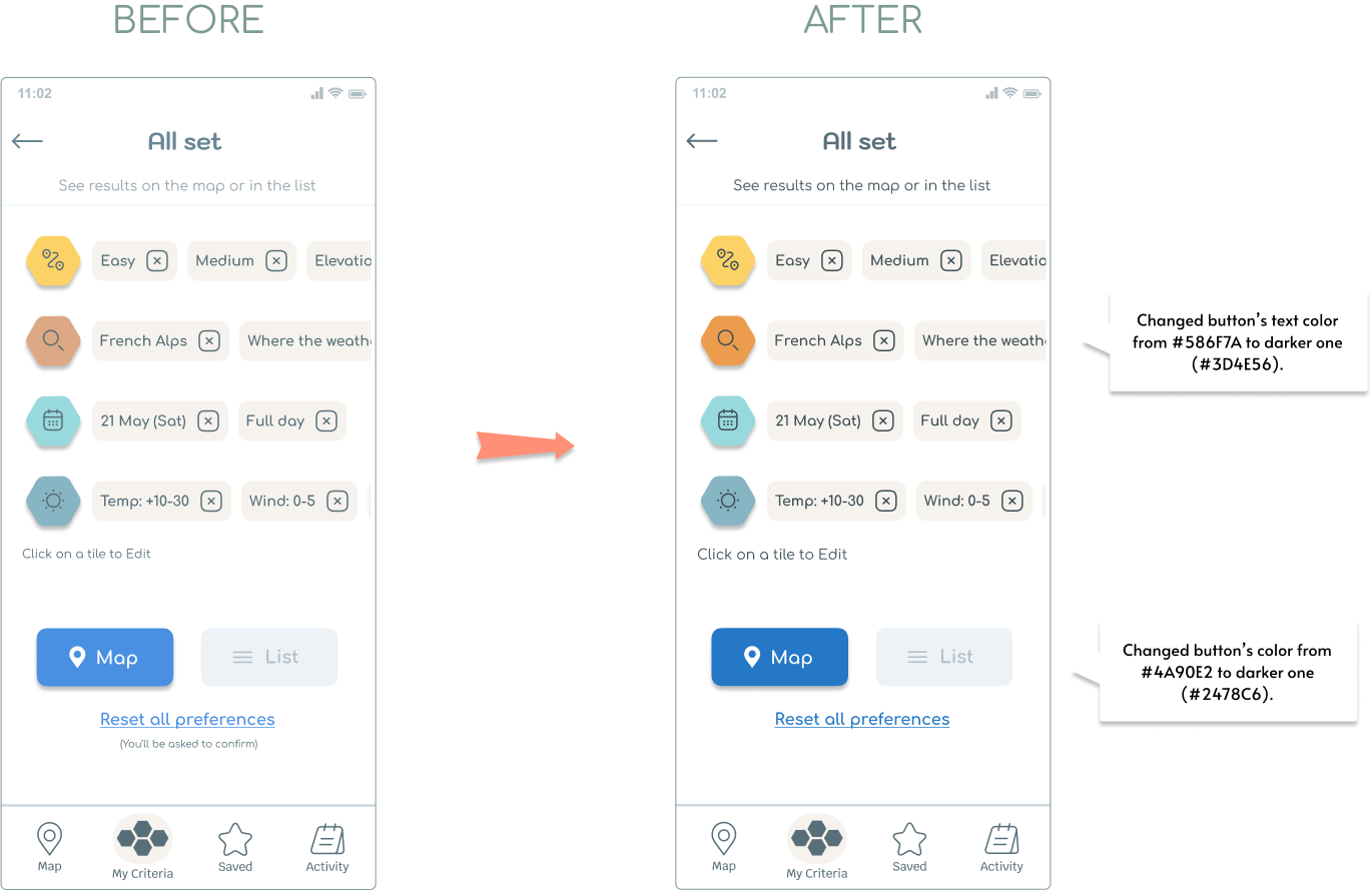
Increase contrast between text and background to help visually impaired users. (Body)
ISSUE 2
Increase contrast between text and background to help visually impaired users. (Buttons)
ISSUE 3
Simplify navigation to reduce distractions for users.
ISSUE 4
Add speech recognition to help users with motor impairments.
ISSUE 5
Simplify busy pages to reduce cognitive load on users.
Polishing the design
Iterated pages
- Intro
- Onboarding
- Map
- Search with filters
- Locations details
- Location list
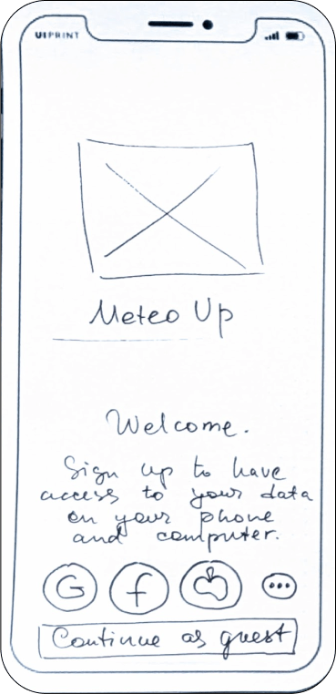

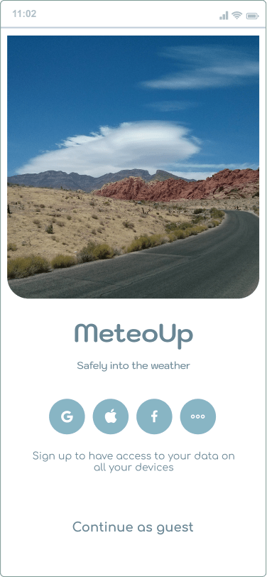
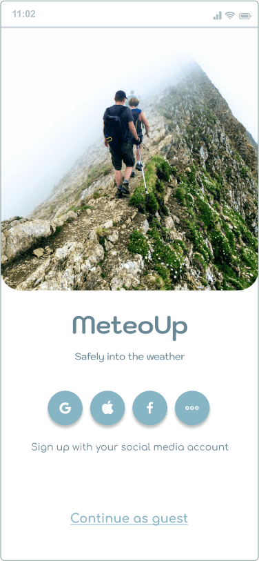
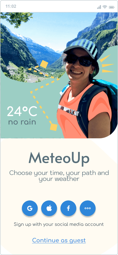
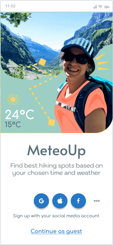
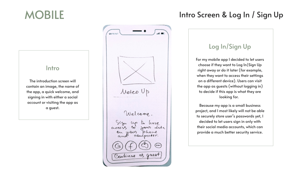
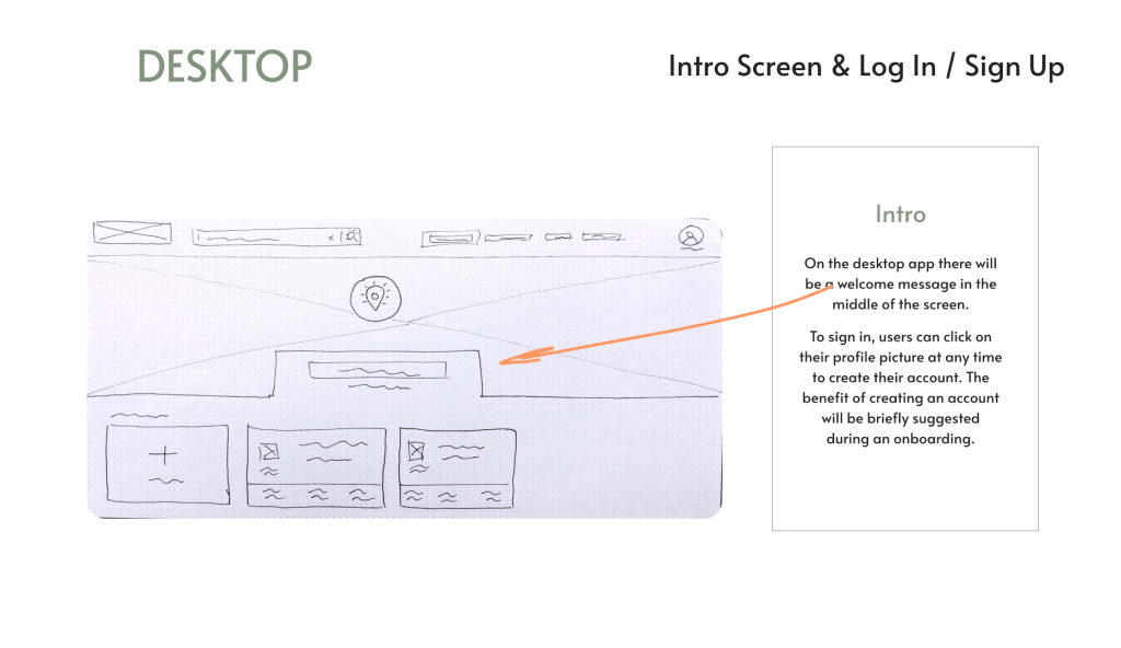
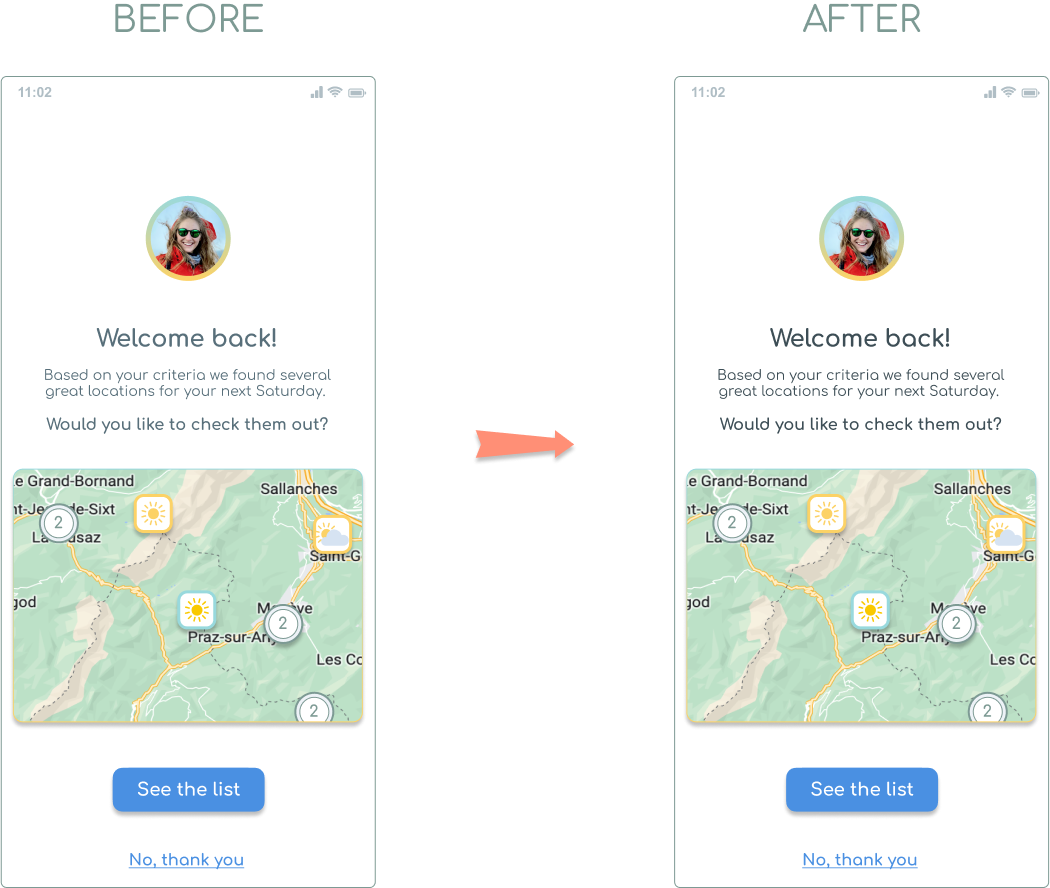
Intro
On the Intro page there were a few changes over time:
- Replaced the photo to show a hiking activity.
- Added graphical elements to make the images more joyful.
- Simplified the text.
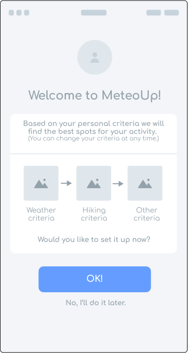
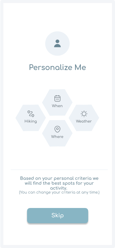
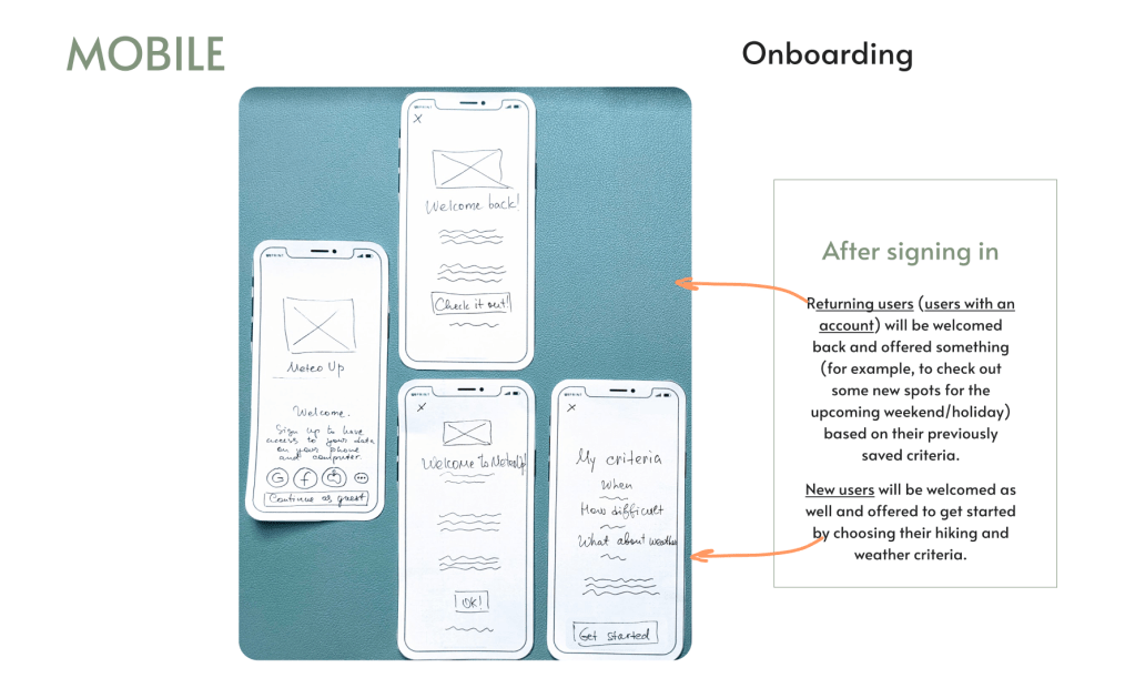
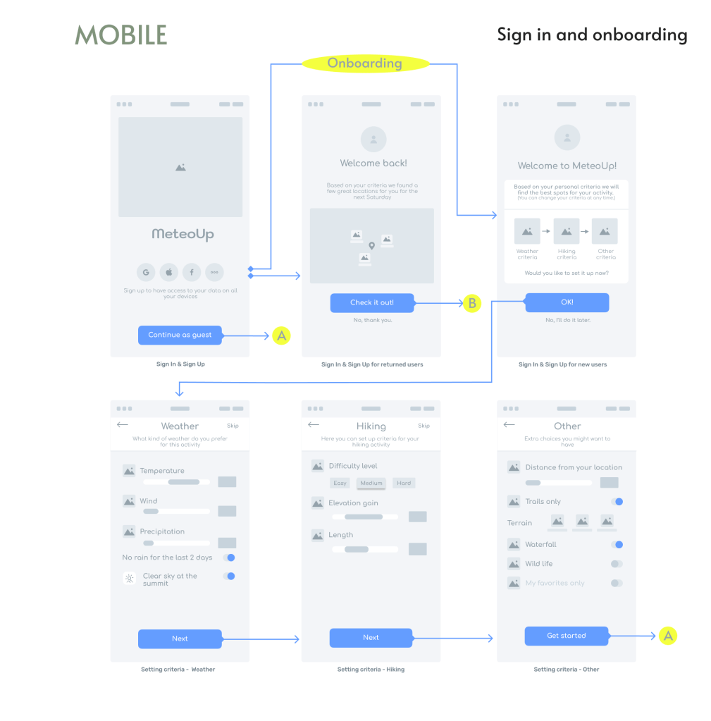
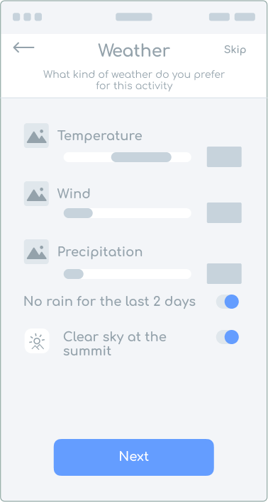
Onboarding
It was challenging to decide which onboarding process would be most beneficial to MeteoUp users.
Initially, I sketched three onboarding screens (My Criteria, Map Type and Invite), and one Welcome page containing a few short paragraphs about the app.
Later, I decided to let users set up their criteria during the onboarding.
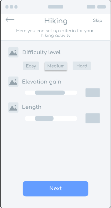
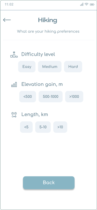
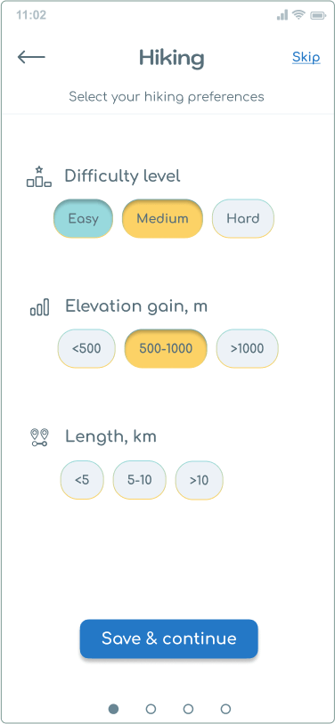
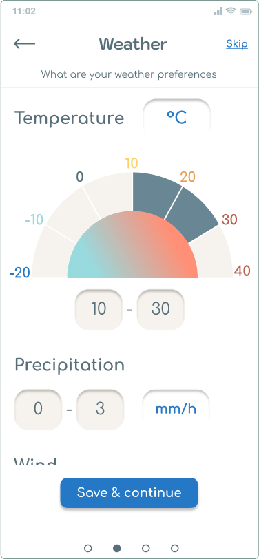
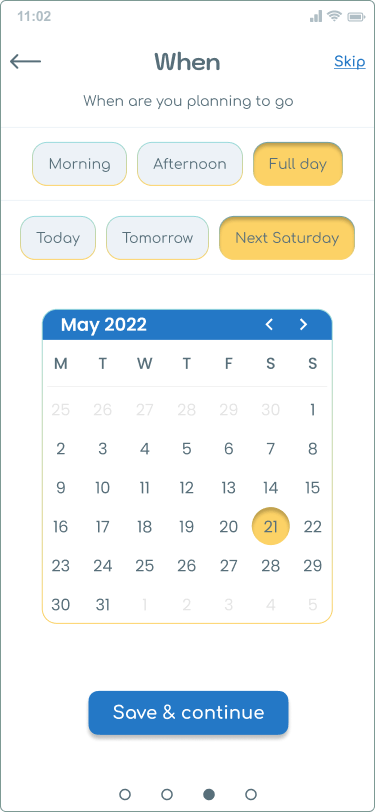
Onboarding :: Hiking
Setting hiking criteria.
After several iterations, the onboarding allowed users to set:
- hiking, …
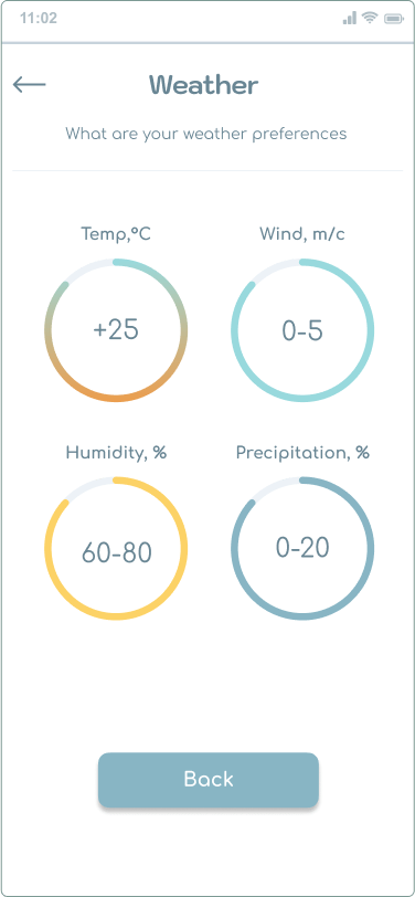
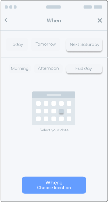
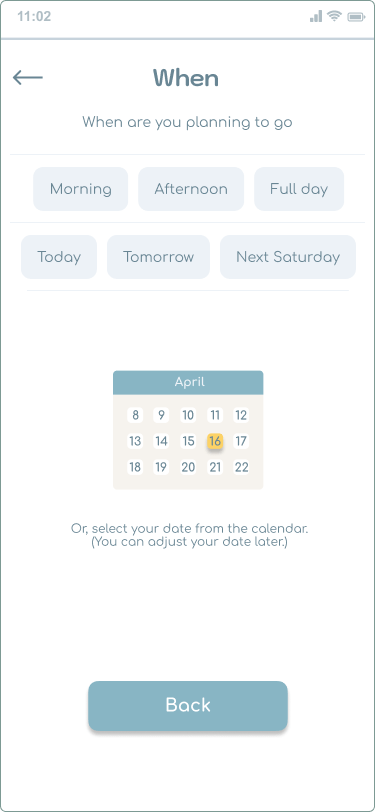
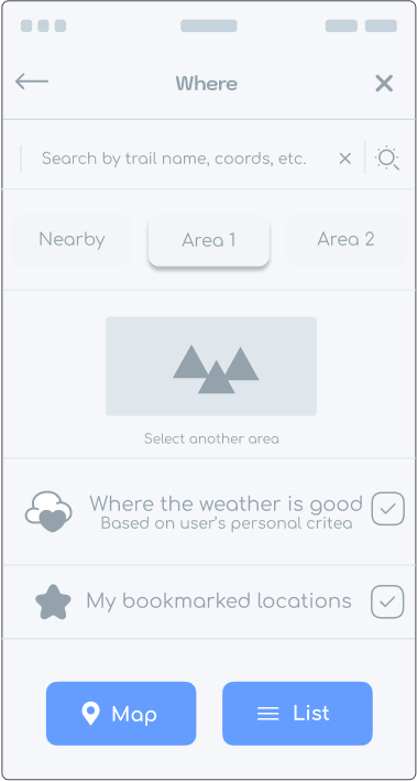
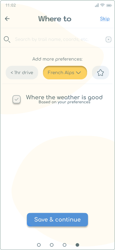
Onboarding :: Where
- location criteria.
Unfortunately, to shorten the onboarding I excluded the introduction about the app on the Welcome page. As a result, some users who never used similar apps before had trouble understanding the concept of the app.
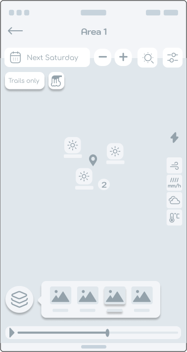
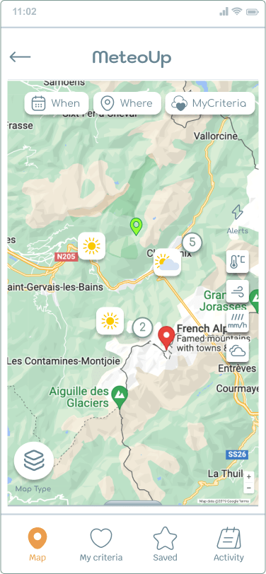
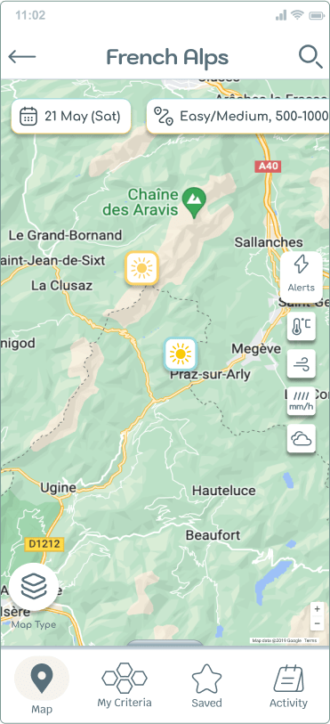
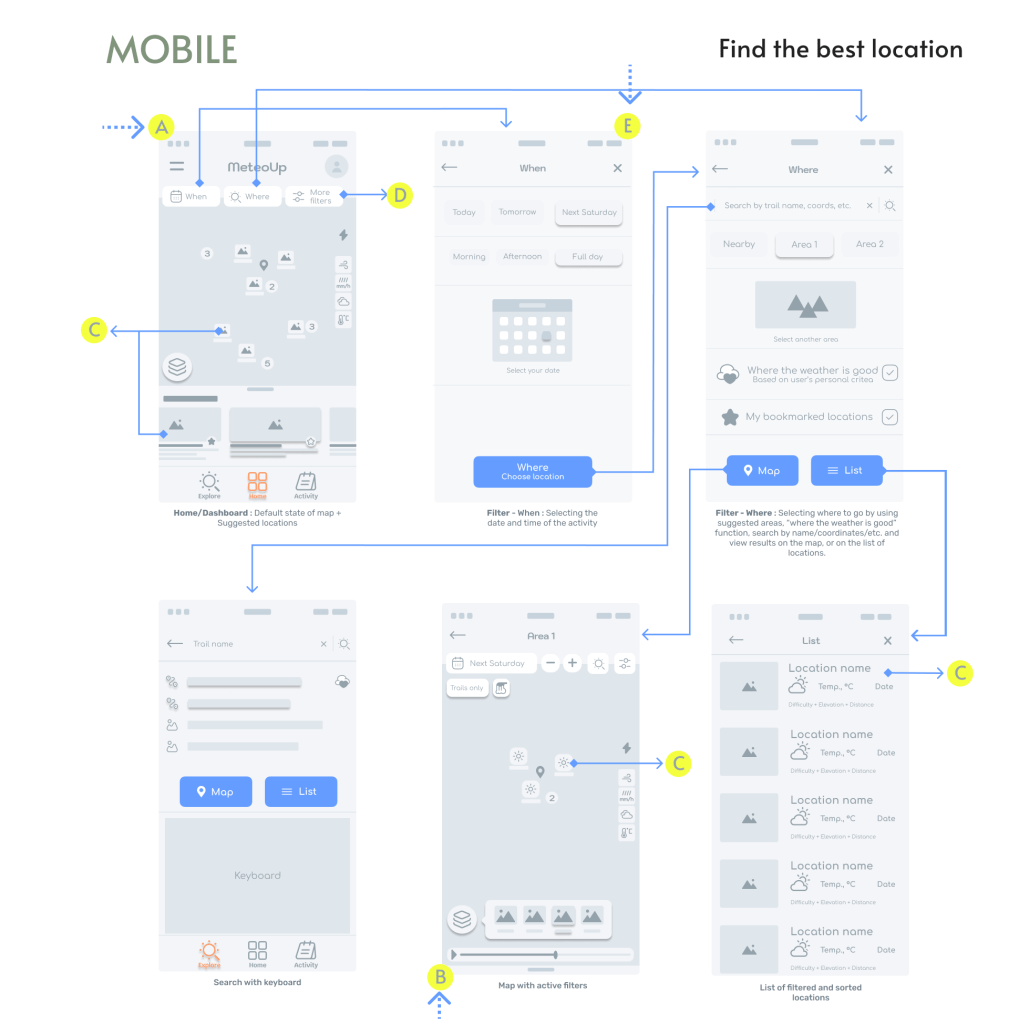
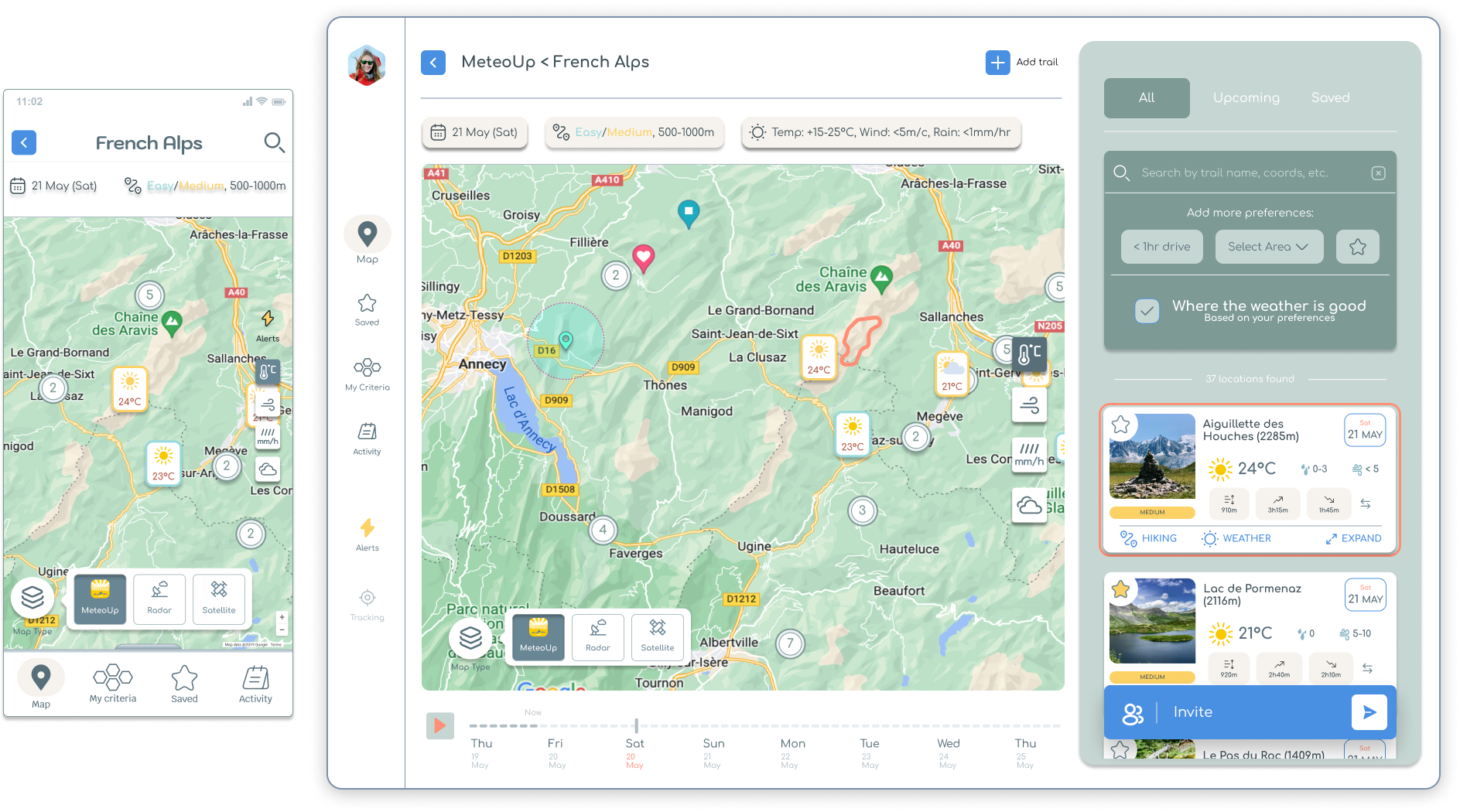
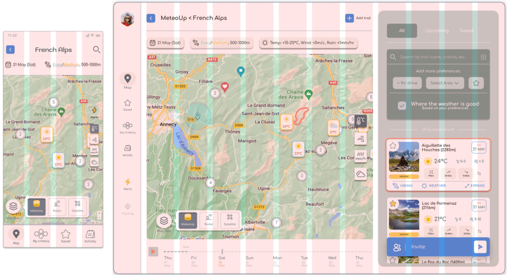
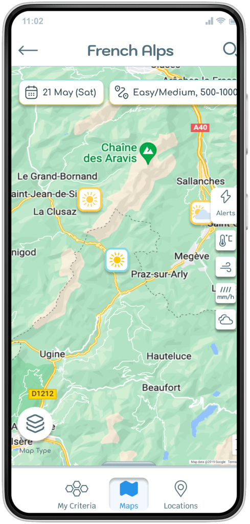
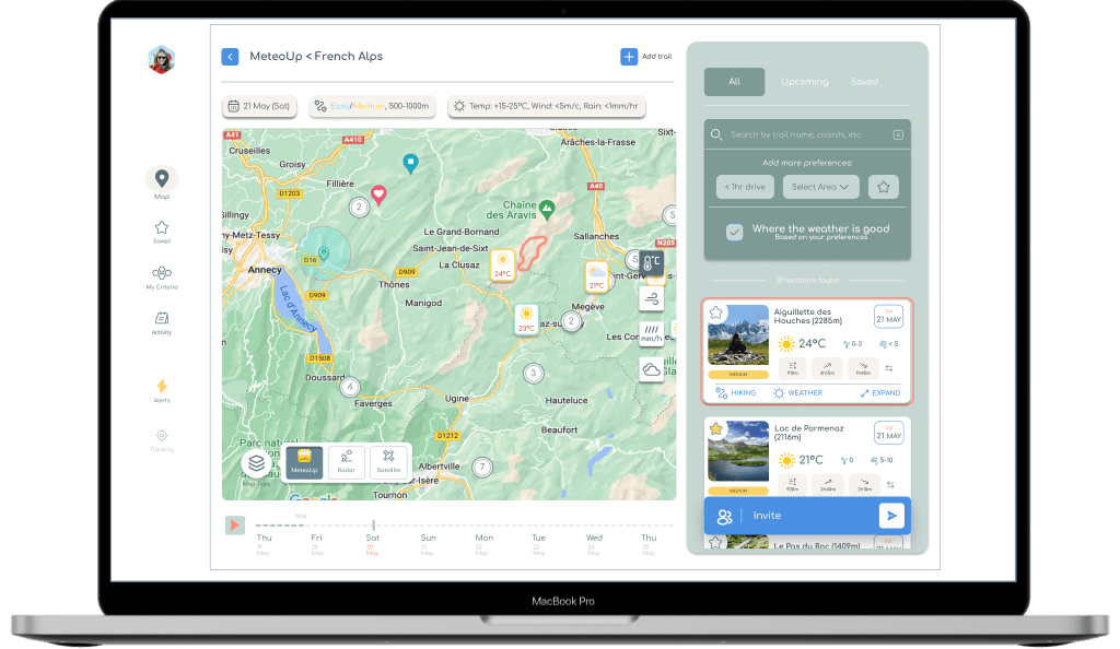
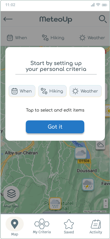
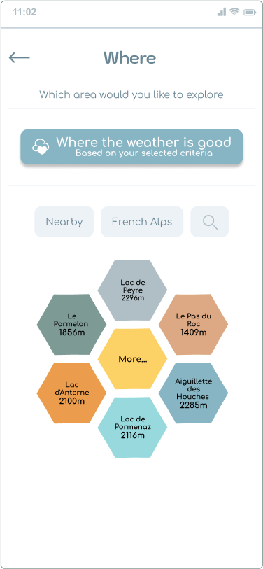
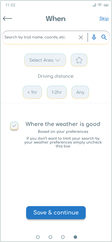
Map
The Map screen had many iterations. The challenge was to show the hiking and weather criteria on the map in a way that’s easy to understand and feels natural to control.
In different designs I tried, the opinion of participants was divided, no design was clearly the best. I decided the original version had the most potential, with the following improvements:
- Added a search icon in the top-right corner.
- Placed the three most important filter buttons on the map, to indicate that they can interact with the map.
- Added a shadow effect to the filter buttons, to indicate they are clickable.
- Made the filter controls work in-page, so that changes are easily visible without leaving the page.
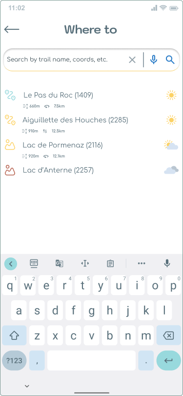
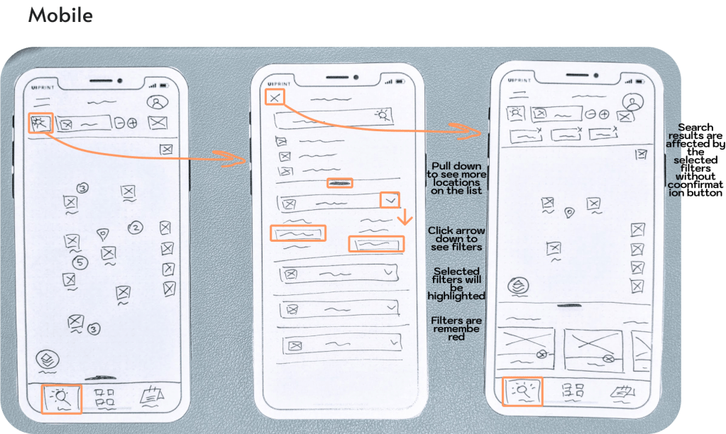
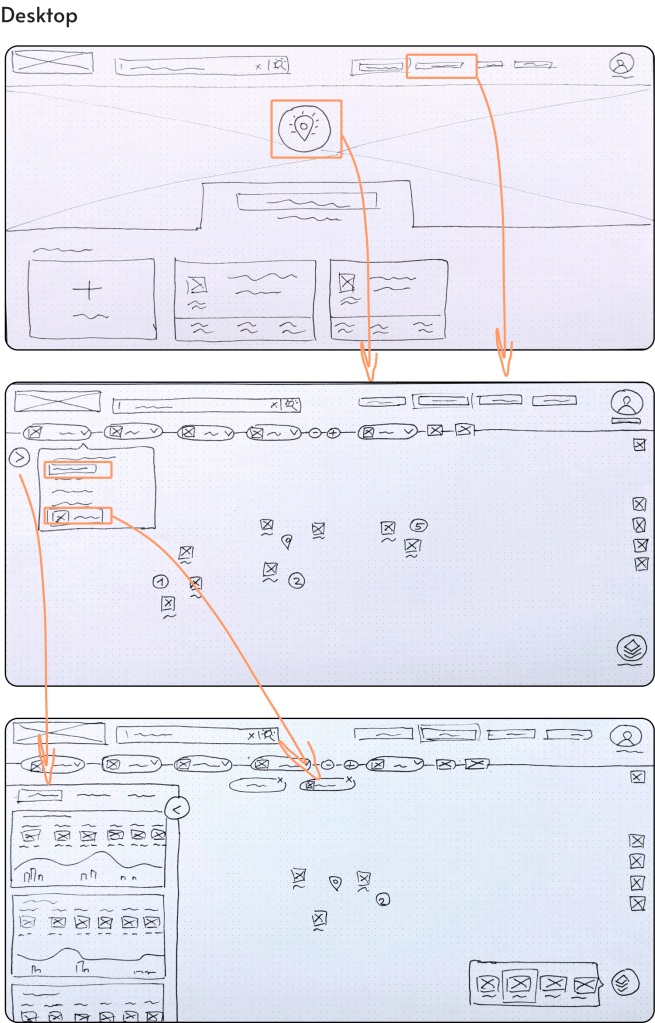
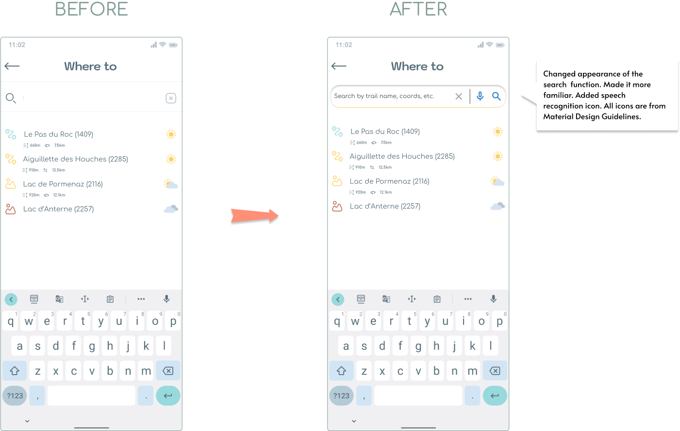
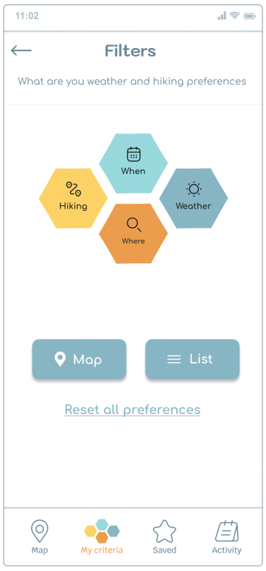
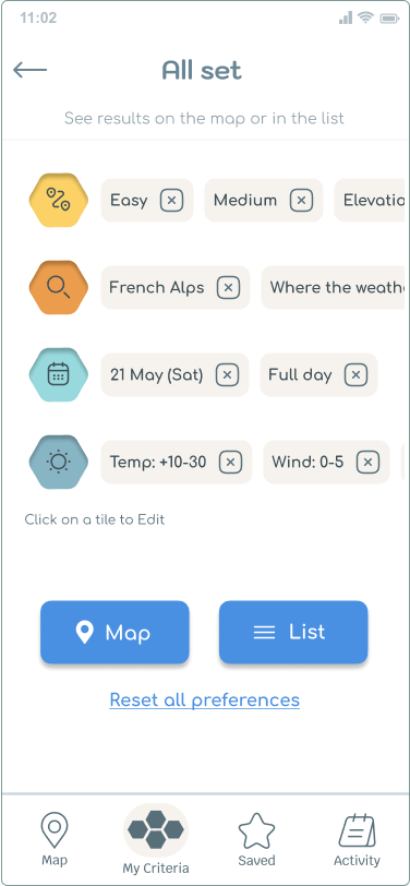
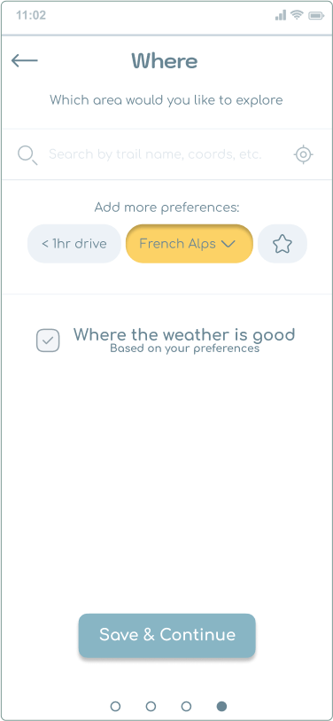
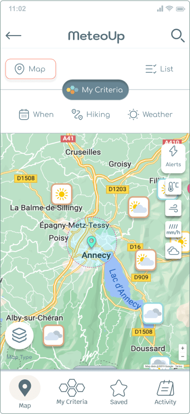
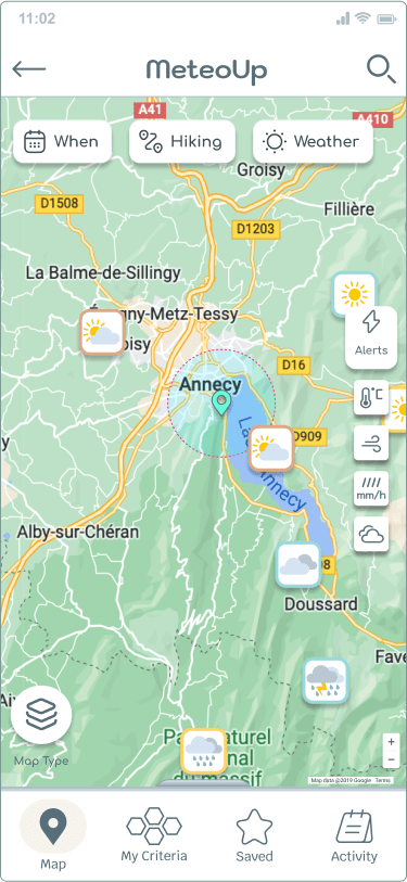
Search with filters
Based on user feedback, I made the following changes:
- I moved the Search icon to the right top corner of the map screen. This created more room for the criteria controls.
- Changed the Search icon to have a more familiar interface.
- Added a speech recognition icon for users who may prefer to use voice command, notably users with motor impairments.
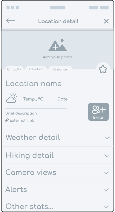
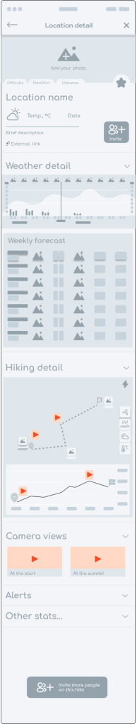
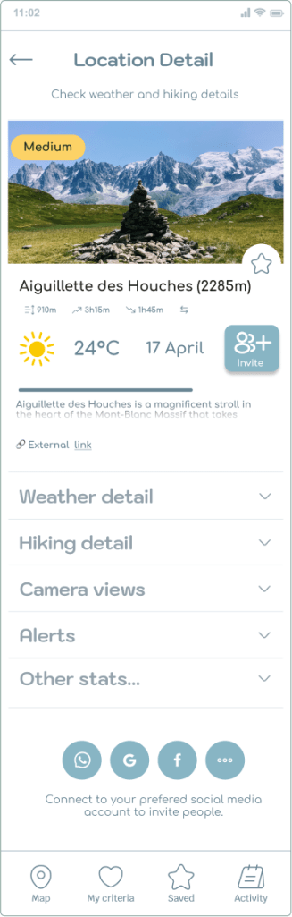
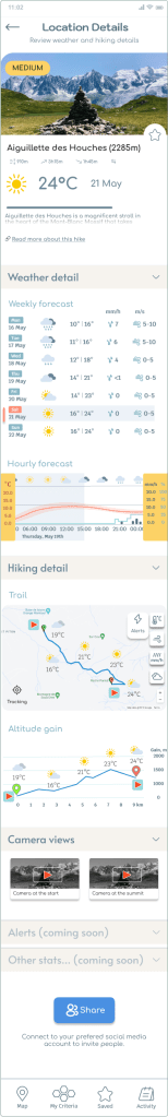
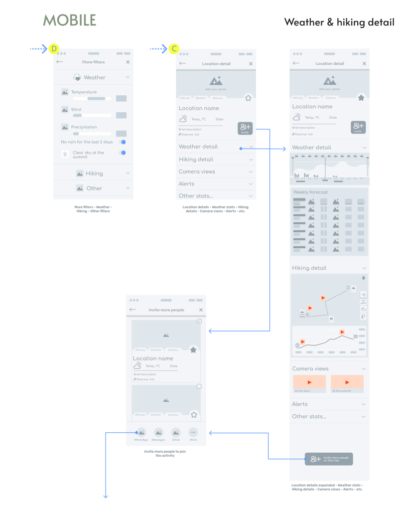
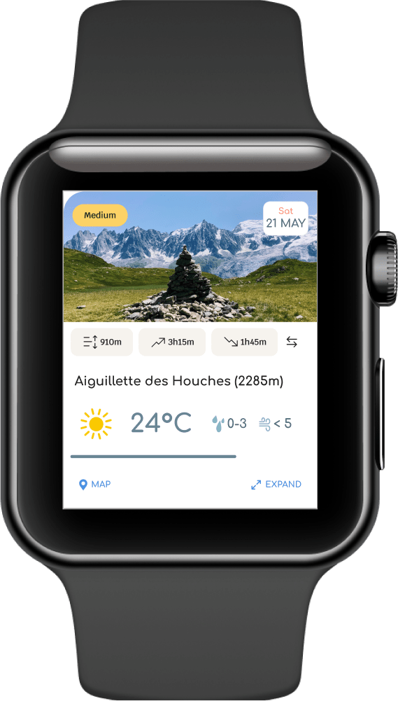
Location details
This screen was favoured by all participants in every test study, so I had no priority to improve its usability.
- Removed the invite button from the top, because users found it distracting.
- Changed the label from “Invite” to “Share”, as this seems a more familiar term to most users.
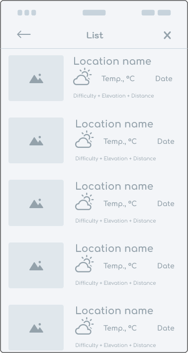
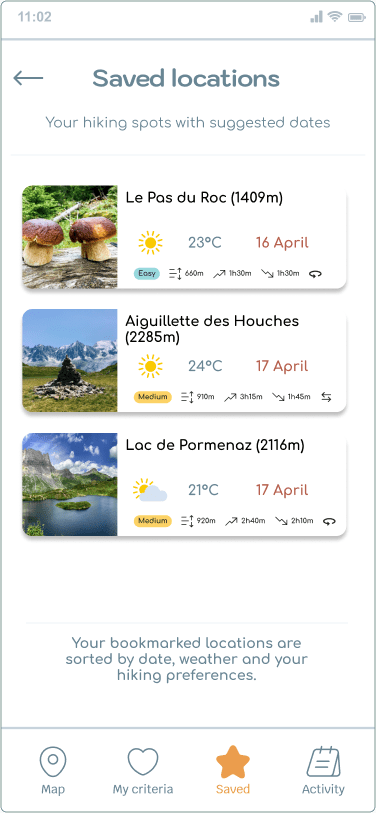
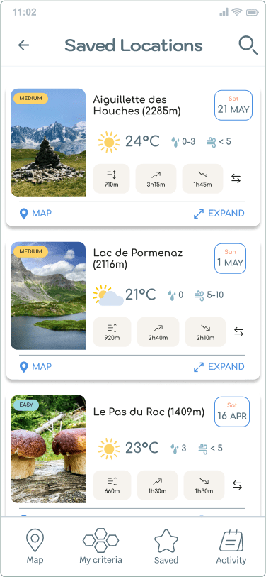
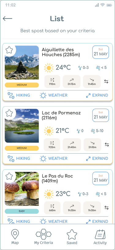
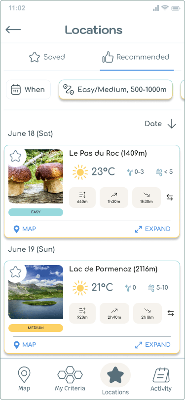
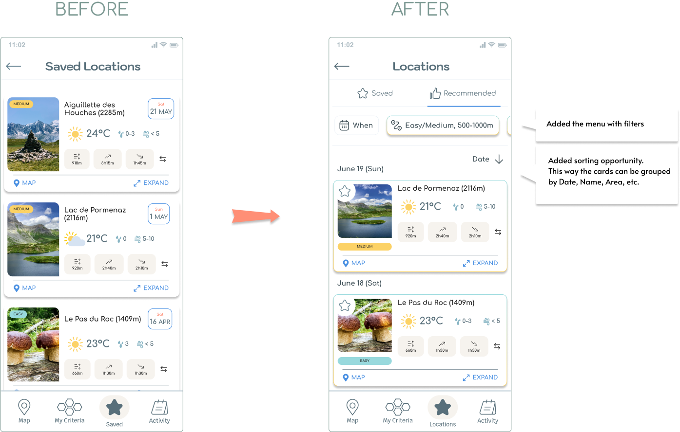
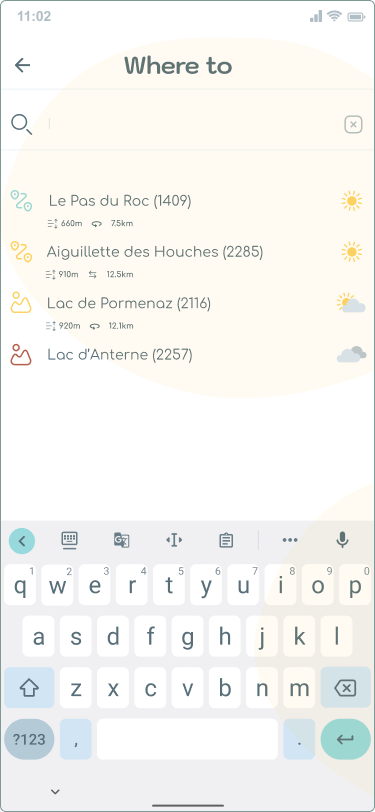
Location list
The Location list screen was improved significantly.
- Enlarged the individual location cards to make them more readable.
- Added action buttons on each card to help finding locations on the map and to access their details page.
- Added a menu that would give clearer separation between the saved locations and recommended ones.
- Added a sorting opportunity by Date, Name, Area, etc.
- Added a menu with filters (the same as on the Map screen) to allow users access to their settings at any time, and not worry about going back to this page.
Updated prototypes (Figma)
